Design smarter, prototype faster
Our Figma Design kit makes designing beautiful and intuitive data visualizations easy.
Summary: This article explains how to deal with starbursts – graphs where one highly connected node overwhelms the view. Starbursts make it hard to understand structure or find insight. You can prevent or reduce them by remodeling supernodes, controlling how much data expands, and using network analysis to prioritize which nodes to load. When starbursts are unavoidable, grouping leaf nodes and applying layouts like organic, structural or sequential keeps the visualization clear and usable.
This is the final post in our three-part series on the common challenges of visualizing graph data for the first time. So far, we’ve looked at two of the three usual suspects: ‘the hairball‘ and ‘the snowstorm‘.
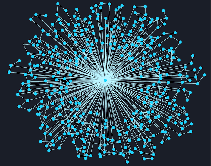
This time, we’ll look at ‘the starburst’ – a graph visualization pattern where one heavily connected node dominates the chart.
In previous posts, we saw how the underlying data source plays determines whether you see a chart dominated by snowstorms or hairballs. In both those cases, the main focus was on visualizing a dataset in its entirety.
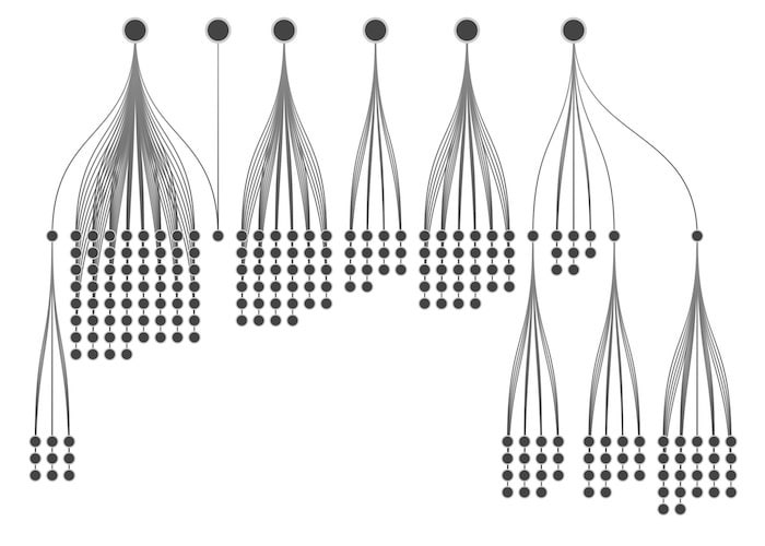
When working with large datasets, users more commonly reveal data progressively. They do this by “expanding in” additional information from the backend on demand. A popular technique is to expand outwards from a node of interest, and ask the backend to bring in the neighbors of that node.
Since there’s no way to predict what a user will double-click on, we risk creating starbursts – sudden and unexpected explosions of data radiating from a node.
Sometimes the nature of your data queries make it easier to predict and mitigate a starburst.
In our TrumpWorld dataset visualization we investigated organizations and individuals connected to the Trump administration. Obviously, Donald Trump himself would be a ‘supernode’ in this network.
Ironic as it seems, to find insight in his connections, it’s better to remove him from the dataset altogether. Instead, we used a simple glyph or decoration – one of many effective visual styling options – to highlight nodes directly connected to Trump, rather than show him as a central starburst.
This kind of data remodeling helps deliver a better user experience, and shows it sometimes makes sense to do the opposite of what seems natural.
Let’s take another example. If you want to visualize email activity as a node-link graph, you’d probably represent email accounts as nodes and emails themselves as links. We did this in our visualization of the Enron emails released in the wake of that company’s collapse.
But now consider this Kaggle dataset containing a release by the State Department of around 7000 heavily redacted emails sent or received by Hillary Clinton. Almost all of these 7000 emails will connect to the Hillary node – a totally avoidable starburst. A much more effective network model here might be to remove Hillary as a node and instead link two email accounts if they both appear cc’d in the same email thread.
Our Figma Design kit makes designing beautiful and intuitive data visualizations easy.
You can also prevent starbursts by limiting how many nodes a user can bring in from the backend. It’s a simple technique but it does have drawbacks. You have to decide carefully which nodes you do and don’t bring in. Visualizing only part of the data can result in a misleading chart, which may cause analysts to draw incorrect conclusions.
If you’re going to throttle data at the point of request, here are some tips.
If you’re clear upfront, there shouldn’t be any big surprises. A message that says “This will bring in 7329 nodes – are you sure?” is better than just silently bringing in the first 50 nodes and not explaining where the rest are. Better still, let the user choose whether they want to import all nodes, some nodes or none at all.
If you have many different node types, it may be better to bring in data one type at a time.
Filtering is a powerful way to reduce noise and direct focus. For example, expanding a node representing a company might bring in 2000 employee nodes, five office location nodes and seven subsidiary company nodes. If your user is only interested in company-to-company relationships, let them choose only to expand in the company nodes and ignore the rest.
When deciding which nodes to bring in, you can learn a lot from the underlying network. Some nodes are more interesting than others, and if you’re going to limit starbursts by choosing a subset of nodes to import, you definitely want the interesting ones.
Social network analysis centrality measures can help here. These graph algorithms identify important nodes in a network. The best measures include:
If your graph database backend comes with the ability to calculate centrality scores and other social network measures, your backend analysis task is easy. If you don’t, KeyLines and ReGraph come with a graph analysis engine which can run in a nodeJS server-side environment to score your nodes before importing them.
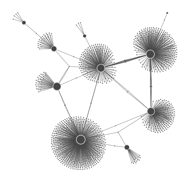
You can’t always remodel your data to remove starbursts, particularly if your visualization is littered with leaf nodes. They connect to the central hub but have no other neighbors in the dataset.
The best way to tackle these is using combos, our intuitive way to combine nodes. You can group the leaf nodes as combo nodes which don’t take up much screen space, but can be opened if needed to see what’s inside.
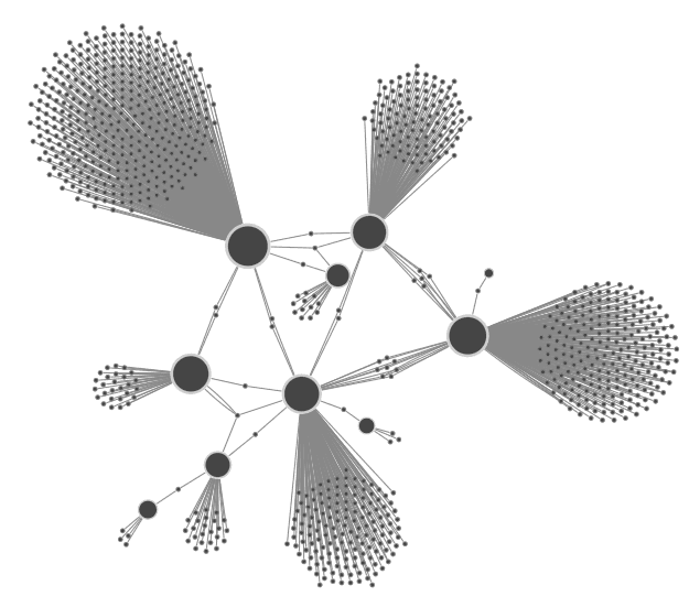
Here’s an example looking at a database of aviation incidents involving DC-9 and DC-10 aircraft. These are long-serving aircraft with a high number of historic incidents associated with them. Showing everything gives us a starburst of airline operators and locations, so I’ve grouped nodes by type into combos to keep things much simpler.
I can now see through the clutter that there are only three airlines who have had incidents involving both these aircraft types.
If all else fails and you’re unable to avoid the occasional starburst, layouts can help. Here are two of our favourites from KeyLines and ReGraph:
If you have the data, we have the toolkits to bring it to life. To get started, simply request a free trial of KeyLines or ReGraph.
Registered in England and Wales with Company Number 07625370 | VAT Number 113 1740 61
6-8 Hills Road, Cambridge, CB2 1JP. All material © Cambridge Intelligence .
Privacy Policy | Security Framework


