Elasticsearch visualization tutorial
Getting started with KeyLines or ReGraph & Elasticsearch
Start a trial
To follow this tutorial, you’ll need access to KeyLines or ReGraph.
Elasticsearch is part of the open source portfolio known as the Elastic Stack. It’s a fast and scalable search engine built on the Apache Lucene software library. Lucene is a high-performance technology for searching and indexing data, but it can be complex to use. Elasticsearch makes Lucene more accessible by pre-selecting sensible defaults, and providing a more intuitive REST API.
The power and simplicity of Elasticsearch makes it popular with organizations that need to search large volumes of data, including Facebook, Wikimedia and Stack Exchange. It supports near real-time data searching on a petabyte scale, using a system of sharding and routing to scale outwards from the beginning.
Using KeyLines or ReGraph, our JavaScript and React SDKs for graph visualization, makes it easy to visualize complex connections in your Elasticsearch index. A well-designed visualization lets users find and interpret patterns and outliers, and intuitively explore connections to get the answers they need.
In this tutorial, we’ll walk through how to connect our graph visualization toolkits to Elasticsearch, creating an interactive application to help users explore flight data.
This guide explains how to load data into Elasticsearch with Kibana, before using this store as the backend for your graph visualization application. It assumes a basic understanding of JavaScript. We’ll use two technologies from the Elastic Stack:
- Elasticsearch – the core search technology
- Kibana – a tool to visualize your Elasticsearch data and navigate the Elastic Stack
You’ll need KeyLines v7.4 and ReGraph v4.4, or later versions, to follow this tutorial – because we’ll use one of our newer features, aggregate links. They’re one of the most popular ways to declutter a visualization and speed up an investigation.
Visualization architecture
KeyLines and ReGraph are JavaScript and React SDKs that are deployed to a web server. A chart element (powered by WebGL with an HTML5 Canvas fall-back) is then embedded on a web page for the user to access.
The integration architecture is very simple. Elasticsearch provides a REST API and works with the JSON data structure:
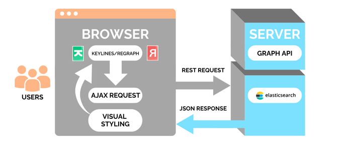
In this scenario, the graph visualization toolkit runs in the web browser. We’ve used KeyLines in this example, but ReGraph works the same way.
When the user requests data, the browser application sends a request to the Elasticsearch REST API. Elasticsearch returns the data as a JSON object that KeyLines or ReGraph styles and displays on the chart.
Step 1: Import the dataset
We can access the dataset in just a few minutes by signing up for a free trial of Elastic. Click the “Search” panel on the home page to reach the Sample Data menu, and and then choose “Sample flight data”:
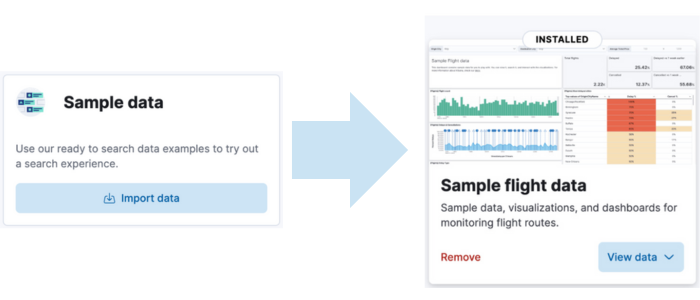
The free trial gives us access to the core search technology, and to Kibana – a tool that lets us visualize our Elasticsearch data and navigate the Elastic Stack.
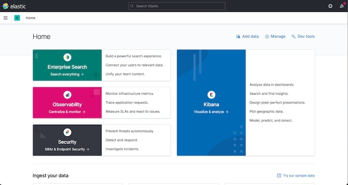
Step 2: Using Kibana
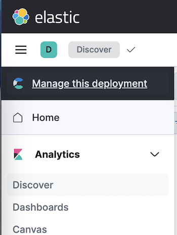
Let’s test out Kibana by querying a sample of the data set. Head over to the Discover subsection within Analytics.
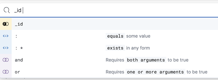
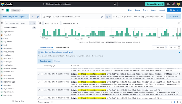
Querying data using KQL (Kibana Query Language) is simple, as it’s an intuitive language. Kibana provides a list of all the fields in the document, as well as various matchers to help you build your query:
Here’s a simple example that queries all the flights leaving Abu Dhabi airport within a certain time range:
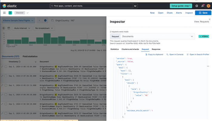
Alongside the KQL query, Kibana also provides an Elasticsearch Query DSL equivalent that we could use to query Elasticsearch directly.
Step 3: Connect to Elasticsearch
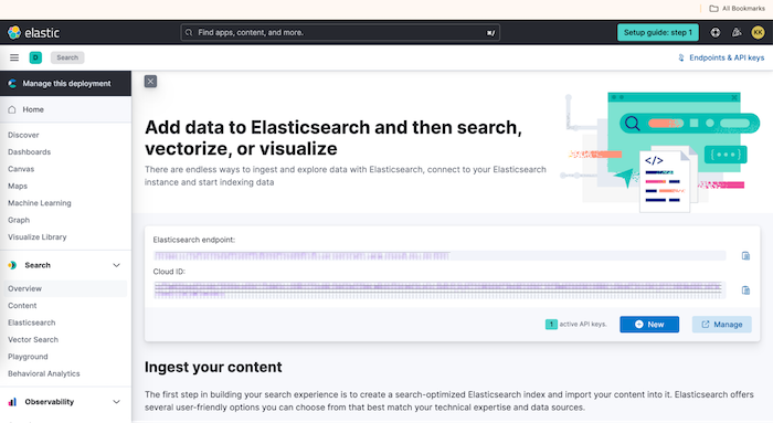
Next, find your Elasticsearch credentials in the ‘search’ section, under ‘overview’, and follow the instructions in the Elasticsearch JavaScript client documentation.
Now we’ll submit our query directly to Elasticsearch. We’ll look at all flights that have departed from airports in the UAE within the last fourteen days:
  const searchRes = await client.search({
      index: 'kibana_sample_data_flights',
      body: {
        query: {
          bool: {
            must: [
              { term: { OriginCountry: 'AE' } },
              {
                range: {
                  timestamp: {
                    gte: 'now-14d/d',
                  },
                },
              },
            ],
          },
        },
        size: 200,
      },
    });
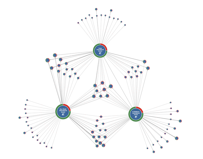
We don’t want to overload our users, so we’ve limited the search term to return just 200 items:
Step 4: Visual styling
Our SDKs offer almost limitless customization and styling options. We’ll demonstrate a few of them here, but you can see the full API, and demos of them in action, on the KeyLines or ReGraph SDK sites. You can request a trial here.
Every time a user clicks, hovers or interacts with the graph data on a KeyLines or ReGraph chart, it raises an event. You can customize the response to each of these events, and style every element of your chart to build your ideal user experience. We’ve sized our nodes based on degree centrality: the larger the node, the more inbound and outbound flights it has. And we’ve used color-coded donuts to represent the proportion of delayed flights:
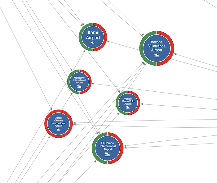
KeyLines and ReGraph’s link aggregation feature instantly streamlines the chart, making it much easier to explore.
When using this feature, it can be useful to let the user peek at the underlying links that make up the aggregation. In this demo, we’ve designed our chart so that when a user zooms in, the links resolve to their respective individual flights. We’ve also styled the aggregated links with glyphs to indicate the number of flights they represent:
Step 5: Creating a basic UI
Search and expandWhen we have large data sets, it’s often useful to load a subset of the data initially and then add more items as the user interacts with the chart. This is known as ‘search and expand’. Let’s allow our users to find out which flights have departed from another airport by double-clicking a node to bring in more data.
We’ll program our app to query the Express server on a double-click event. This will fetch additional data associated with the clicked airport node. To keep the chart manageable and user-friendly, we’ll limit the response to four results:
    const airportSearchRes = await client.search({
      index: 'kibana_sample_data_flights',
      body: {
        query: {
          bool: {
            must: [
              { term: { Origin: airport } },
              {
                range: {
                  timestamp: {
                    gte: 'now-14d/d',
                  },
                },
              },
            ],
          },
        },
        size: 4,
      },
    });
Visualizing our data on a map
Our dataset includes latitude and longitude coordinates for airports, so it’s easy to visualize them on a map:
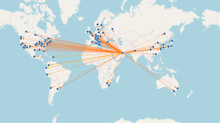
This gives us a different perspective on our data, putting it in real-world context. If we plan to use our application for a deeper understanding of travel patterns, we could bring in more datasets to validate our observation and carry out more in-depth analysis. This visualization is just a snapshot of two weeks’ activity, but we may want to visualize the flight map as it evolves over time, tracking flight schedules, delays and trends.
Check out KronoGraph, our timeline visualization toolkit, to find out how timeline visualization can bring a whole new dimension to your investigation.
