This blog post focuses on Esri ArcGIS data visualization and how our toolkits can support powerful geospatial analysis techniques.
The ability to visualize connections on maps is a valuable technique when you’re analyzing graph data. Whether you’re investigating locations of fraud, using network mapping software, or creating a crime suspect’s geo profile, geospatial information takes insight to another level.
We’ll demonstrate how to integrate KeyLines with Esri’s open source esri-leaflet library to access their ArcGIS mapping platform, but the basic principles apply to ReGraph, our React graph visualization toolkit, as well. We’ll also explore the added benefits of integrating with KronoGraph, our timeline visualization toolkit that drives investigations.
We’ll first investigate a New York crime spree to show how easy it is to bring your geocoded connected data to life. Then, we’ll introduce a hybrid view that co-locates entities in both time and space. By combining graph and timeline visualization we’ll provide the detail needed to help analysts and investigators understand the exact sequences of events.
KeyLines and third-party mapping service providers
The KeyLines geospatial feature gives you the freedom to work with a wide range of third-party mapping service providers. This example looks at Esri. In their words:
Esri is the global market leader in geographic information system (GIS) software, location intelligence, and mapping. Today, Esri software is deployed in more than 350,000 organizations including the world’s largest cities, most national governments, and 75% of Fortune 500 companies.
ArcGIS is Esri’s comprehensive, scalable digital mapping and analytics software. To make the most commonly used pieces of the platform more accessible, they created esri-leaflet – an open source library governed by the Apache V2.0 license agreement. It’s open to any developer to use, embed, or incorporate in their apps.
If you have the right ArcGIS licence, you can use Leaflet options to access popular ArcGIS services from other applications, including KeyLines.
One way to understand the context around location data is to layer it onto an ArcGIS basemap. KeyLines works seamlessly with every basemap layer – from world imagery and streets, to topographic markups and customized cartography.
More on this later. First, let’s get familiar with our dataset.
Visualizing and styling the dataset
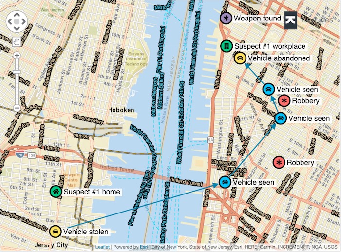
We’re using fictitious data containing locations and events to reflect a crime spree. Locations are stored as JSON objects, and there are latitude and longitude properties on each node.
KeyLines supports styling options to customize your data, make it more accessible and highlight important information. Here we’ve used color-coded nodes:
- red for robberies
- blue for vehicle sightings
- yellow for vehicle-related events
- green for the suspect’s known addresses
- purple for related information
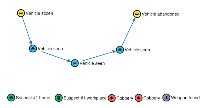
A location-based network doesn’t make sense without a map
We can see a route between events, but it lacks context. How far apart are the event locations? Are there connections between the suspect’s known addresses and where these events took place?
Here’s where the power of maps comes in.
Integrating KeyLines and ArcGIS using esri-leaflet
Using the esri-leaflet library gives KeyLines easy access to the street, district and satellite image data we need to fully understand the connections in our crime data.
Let’s start by removing the default tile layer used by KeyLines, so we can replace it with an ArcGIS one.
chart.map().options({
 tiles: null
});
Then we’ll get the Leaflet map from the KeyLines chart once it’s loaded and add ArcGIS’ topographic basemap layer to it instead.
chart.load(data)
await chart.map().show();
const leafletMap = chart.map().leafletMap();
let basemap = L.esri.basemapLayer('Topographic');
basemap.addTo(leafletMap);
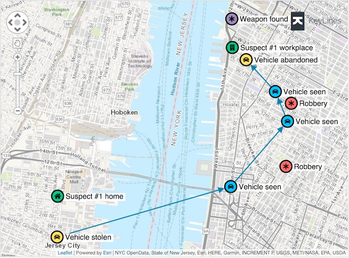
The topographic view adds context
What a difference. We instantly gain a more intuitive view of the data. The locations of Suspect #1’s Home and Workplace are much more relevant now we can spot their proximity to the start and end of the crime spree.
Flexible mapping options
Geospatial mapping has already revealed insight from connections in our data. With access to multiple ArcGIS basemaps, we can extend our analysis and try alternative ways of looking at the world.
With one click, let’s remove the existing basemap and switch to a view where transport routes are more prominent to see what we can discover.
basemap.remove();
basemap = L.esri.basemapLayer(basemap2, { zIndex: 100 });
basemap.addTo(leafletMap);
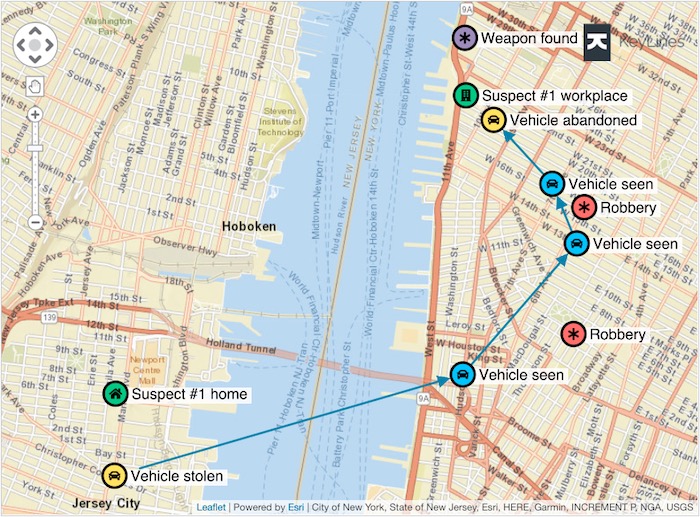
We can go one further by adding overlays. These layers are displayed in front of basemaps and contain relevant information about specific features, in this case, highlighted street names.
const labelLayer = L.esri.basemapLayer('ImageryTransportation', { pane: 'tilePane', zIndex: 200 });
Spotting street names more easily may help us plot the suspect’s route. With overlays, you can mark up maps any way you choose.
There’s another ArcGIS service that can help us here.
Extending the power of geo analysis
Through the open source esri-leaflet library, KeyLines has access to ArcGIS Server geocoding services. This powerful tool can convert a description of a location into an actual location on a map. It means you can create and display exactly the details you need in an ArcGIS data visualization.
In our crime scenario, we want to see which police stations are located near the events. Let’s search for ‘Police Station’.
const geocodeService = L.esri.Geocoding.geocodeService();
geocodeService.geocode().within(bounds)
 .category('Police Station').run((error, res) => {
   // Create KeyLines items using the search results
   if (res) {
     const items = res.results.map((station, index) => {
       // Create a KeyLines node for each police station
       return {
         type: 'node',
         id: `policeStation${index}`,
         t: station.text, // Name of the station
         pos: station.latlng // Position on the map
         // ... rest of node properties
       };
     });
     chart.merge(items);
   }
 });
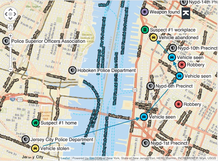
Automatically, new nodes for police precincts and departments are brought into the chart. They can be interacted with or manipulated in exactly the same way as the original nodes in our data: the power of KeyLines analysis tools now applies to them too.
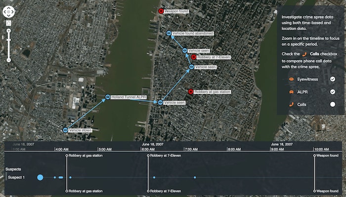
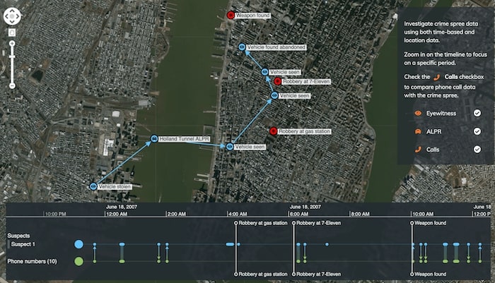
Investigate sequences of events
By integrating KeyLines or ReGraph with KronoGraph, our timeline visualization toolkit, your users get further insight from their time-based data in new and inventive ways.
Timeline visualization reveals relationships between events, showing cause and effect and highlighting time patterns that are harder to spot in the graph view. It helps investigators to quickly recognize how events unfold.
Here we show the graph view together with observations and phone calls in a timeline. The crimes are shown as red nodes on the map, and black markers on the timeline. With this powerful combined view, it’s easy to spot the pattern of events that took place around the time of the robberies.
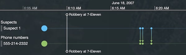
We can recognize instantly that the suspect made several calls to one particular number. Revealing this pattern would be impossible without a timeline view.
Integrating KeyLines and KronoGraph is simple. Check out this developer tutorial
Ready to try our toolkits?
Visualizing geospatial data is crucial to revealing insight hidden in your connected data. It’s a powerful element of link analysis software for law enforcement, cyber security and fraud detection.
KronoGraph timeline visualization offers intuitive ways to investigate sequences of events. It works as a standalone tool and integrate seamlessly with our graph visualization tools.
We chose to showcase how quick and easy is to integrate our graph and timeline visualization toolkits with the esri-leaflet library, but if you want to take your geospatial data visualization to the next level, try MapWeave. It comes with expert support, docs, inspirational demos and a smooth DevEx, plus easy integration with our other SDKs.
If you’re keen to find out more about our SDKs, request a free trial.
Share: