Version 3.0 of ReGraph, our graph visualization toolkit for React developers, features one of its biggest updates yet. The events engine that underpins every carefully-designed user interaction has been rewritten from the ground up.
What does that mean in practice?
It means your application is custom-built to stand out from the crowd. It means analysts get the best user experience, with every interaction tailored to their workflows, revealing insight faster. And it means the React developers building your application are happy, because the new event handlers make it easy to keep other React components in sync with the chart.
In this blog post, I’ll walk through some of the powerful techniques made possible by the new events engine.
What’s so special about interactions?
There are many fantastic presentation tools out there that produce beautiful data visualizations. But when you need to find the hidden threats or evolving relationships in complex connected data, however nice it is to look at, a fixed image isn’t enough.
What’s missing is the ability to explore theories, focus on standout items, play with ideas and change the shape of the data to give users a different perspective. That’s how they get a deeper understanding of a network.
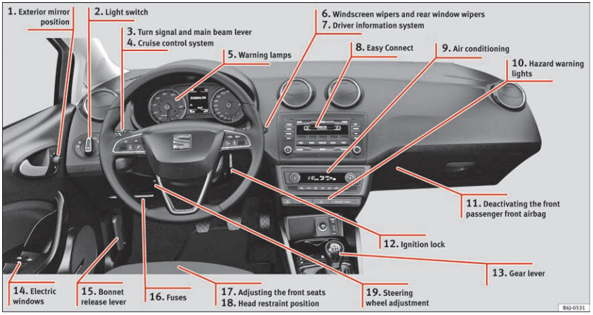
To demonstrate the importance of interactivity, imagine if every driving lesson you had was based in a classroom. The instructor points out everything you can see from the driver’s seat on a static image, explains what every element does and which order you need to operate them in.
It’s hard to imagine being able to learn this way, right?
Learners need to experience what it’s like to steer, change gear, work the gas pedal and countless other new behaviors that soon become natural and familiar.
It’s the same when you’re designing a graph visualization application for your users. You want to give them every opportunity to interact with the chart in a way that supports their workflows. And those interactions – every mouse click, drag, scroll or keyboard shortcut – should feel intuitive and effortless.
That’s why we’ve made our new events API even more powerful, intuitive and customizable. Let’s see what it can do.
Modify your drag behaviors
Users need to move key items around the chart easily without ruining the overall display. A good example of where it’s important to maintain the relative order of nodes is using ReGraph’s sequential layout. It’s specifically designed for connected datasets that feature distinct levels of data – think IT network infrastructure, management hierarchies and blockchain datasets.
With the new events engine, additional interactions mean users can select the items they want to move, then change the position of levels through dragging. We’ve achieved this by decoupling select and drag in the events API, giving greater flexibility and far more options for customization.
You can also give users a uniquely-tailored experience by designing specific interactions around modifier keys. In our sequential layout example, pressing Shift moves all the nodes in a level, while Ctrl moves only the children of the selected node. Clever, eh?
There’s no need to write masses of extra code to listen to keyboard events, plus you can design interactions that are consistent for your Mac and Windows users.
New to ReGraph?
Powerful, intuitive drag actions
In ReGraph 3.0, drag events aren’t just for moving items around the chart. We’ve made dragging more powerful, with the ability to perform a whole range of additional intuitive actions.
In these examples, we’ve assigned different behaviors to left and right mouse clicks, and provided special behaviors based on whether the user clicks a node or the background. With the onDragStart function customized to match typical user behaviors, they can pan the chart and use marquee select for faster navigation and more precise selection.
The aim here is to make life easier for users. So if they need a quick and simple way to create links between nodes, your application delivers.
Clean, clear charts with snap to grid
Large, messy, disorganized charts are hard to understand. If they’re shared with colleagues or presented in court, they can affect your credibility. For a tidier, more orderly option, your developers can add logic that lets users snap items to a grid or circle.
Snapping to a grid or circle aligns things precisely. It’s great for users as they can now place items accurately to create clean, clear visualizations. The new onDrag event listens continuously while dragging is taking place, so you can design the right snap behavior as a node moves to a certain position.
Annotations for better understanding
It’s usually not a good idea to visualize every piece of information your data holds, because users end up with a confusing mess that’s hard to understand. Getting your visual model right means showing what the user needs and no more.
[For more on this, see Data visualization UX: How to avoid wrecking your graph and timelines]But valuable property information may contain vital details about chart items, so users still want to access it when they need to. Annotations are perfect for this. You can annotate or decorate the chart with your own custom HTML, and with our new onViewChange event, have it follow the position of a node as the user moves it or switches view.
You can customize the same behavior for labels on groups of nodes, where the label adapts as you move around the chart. The new onViewChange event helps create these seamless actions and animations.
But it’s not just annotations on particular nodes which can be kept in sync. Sometimes, in addition to the snap-to-grid behavior we saw earlier, users want to see grid lines across their entire chart. In this example, we’ve added a background layer to the chart which moves and adapts to the view as the user zooms and pans.
Start working with the new events engine
In ReGraph 3.0, we’ve rewritten our event handlers so you can create React applications that provide the intuitive experience your users deserve. If you’re using KeyLines, our JavaScript graph visualization toolkit, you’ll benefit from an events engine that’s just as powerful. Go ahead and explore the exciting events engine in KeyLines.
Whatever your interaction ambitions might be, we’d love to help you create a stand-out graph visualization that gives users the best tools to interrogate their data quickly and effectively.
Ready to build a slick graph visualization application? Just sign up for a free trial and we’ll help you get started.


