Figma Design Kit
Prototype, refine and align your UI using a structured design system built specifically for graph and timeline-driven applications.
Download now →Explore our webinars,
reports and articles
Everything you need to start building effective graph visualizations that'll help your users find insight in connected data fast.
View now →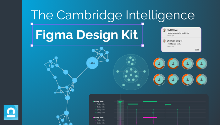
Prototype, refine and align your UI using a structured design system built specifically for graph and timeline-driven applications.
Download now →Find out how to prevent financial fraud with real-time graph analytics, accelerating investigations from weeks to hours.
Discover how visual link analysis helps analysts to get a 360 complexity view, overcome data silo challenges and focus on the data that matters.
In this webinar, product leads Bonney and Dan give you a guided tour of MapWeave, our new geospatial visualization SDK.
See how successful businesses work with graph visualization and AI technologies to uncover insights in their complex connected data.
Discover why graph and timeline visualization is essential for understanding complex connected data.
Learn the key design principles for visualizing complex connected data, based on six real UI/UX examples taken from the world of cyber security.
Everything you need to start creating effective data models that’ll help your users find insight in connected data – fast.
The ultimate guide to understanding complex cloud infrastructure and combating cyber threats using data visualization.
Embarking on your graph visualization journey? Our Buyer’s Guide will help you navigate your options and choose the right tools for your project.
Want to know how to do timeline data modeling? We explore best practices with real-world examples of the best timeline modeling strategies.
We explore basic color theory, and how carefully-chosen colors can help make your visualizations look good, and make your data more compelling.
Why use a commercial SDK instead of an open source graph visualization option? We compare both options to see which is right for your project.
Discover how we use KeyLines and KronoGraph to create data flow visualization apps, essential for investigating financial fraud, AML & more.
Unlock the power of time-based data visualization and analysis with our ultimate guide. Learn techniques to display and interpret data for better insights.
Our Head of Product, Dan Williams, explains what our SDKs can bring to your roadmap – a data visualization that’s more than just impressive aesthetics.
We explore map data visualization: what it is, what it’s for, and why you need it if you’re serious about analyzing connected data.
Learn how graph analytics offer a clearer understanding of your network and help you improve your supply chain management.
In this ultimate guide to supply chain visualization, find out why the most successful models have visual network and timeline analysis at their core.
When your diagramming tools aren’t working hard enough for you and they’re holding you back, it’s time to upgrade to the insightful world of graph visualization.
Discover more about how we’ll help you get your project off the ground, from product demos and project health checks to exclusive previews of upcoming features.
How to understand social networks analysis, including an introduction to some of the key centrality measures.
An easy introduction to social network centrality measures. Learn more about degree, betweenness, closeness, eigencentrality and PageRank centrality.
Discover some of the game-changing graph design features of KeyLines and ReGraph, our graph visualization software development toolkits.
Registered in England and Wales with Company Number 07625370 | VAT Number 113 1740 61
6-8 Hills Road, Cambridge, CB2 1JP. All material © Cambridge Intelligence .
Privacy Policy | Security Framework
