
This blog post explores the complex world of financial fraud detection. We look at how ArangoDB’s powerful query language, combined with our data visualization technology, creates an effective anti-fraud application.
The financial fraud detection challenge
Detecting fraud is a difficult business, and investigating fraudulent banking transactions comes with its own complex challenges. An individual transaction might seem perfectly legitimate, but when it’s analyzed in the context of multiple transactions, patterns emerge that uncover criminal behavior.
But how do you find a particular pattern of transactions in a huge dataset of background activity? Here’s where a graph query language is very useful.
ArangoDB are experts in handling scalable, fully managed graph databases. Their ArangoDB Query Language (AQL) is declarative, client-independent and easy to understand.
When they shared some example AQL queries with us, we were keen to run them against a fictional financial fraud dataset. We wanted to find out:
- How can we present query results to analysts so they can easily investigate each candidate pattern?
- How can we help them to spot false positives and determine the next course of action fast?
Data visualization has the answers. It’s both an effective analytical tool (“Is this really a fraudulent pattern?“) and a presentational tool (“How can I explain to others why I came to this conclusion?“)
We took representative results of the AQL queries and put together some tips and tricks on how to make compelling, interactive visualizations for financial fraud detection. Let’s see how.
Modeling the financial fraud dataset
- account holders are linked to the accounts they own
- accounts are linked to each other by transactions
- transactions include timestamps and transaction sizes as properties
We’ll build a simple React application on top of this database using ReGraph, one of our graph visualization toolkits, and KronoGraph, our timeline visualization toolkit. By using these two different SDKs, our application will display the same transactions as both a network graph and a timeline of events simultaneously.
Now we need to decide on the visual graph model for our database schema. It’s easy to mistakenly assume that every node and link in your database should become an item in your chart. But our focus is on patterns of transactions – not every individual transaction.
For this reason, we’ll choose a single node and link type for our visual representation of the data. We’ll show accounts as nodes, with account holder information as a property of those nodes. Here’s what a fragment of the dataset looks like in ReGraph:
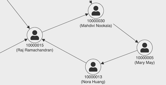
With a few lines of ReGraph code I added a font icon to the nodes – one of many styling options for providing real-world context. I’ve also displayed the account number and the account holder’s name as labels.
I’ve stuck with a simple monochrome color scheme for now. Later we’ll use color to draw attention to important areas of the view.
Querying the database
The first query we’ll try detects a fraudulent pattern known as a fraud ring, where money passes around a chain of accounts and ends up back where it started. Here’s the AQL query to detect suspicious rings of between 5 and 10 hops:
WITH transaction, account
FOR suspicous_account IN account
   FOR acct, tx, path IN 5..10 OUTBOUND suspicous_account._id  GRAPH 'fraud-detection'
   PRUNE tx._to == suspicous_account._id
   FILTER tx._to == suspicous_account._id
RETURN  path
It’s a really compact way of finding sub-patterns within the graph. The output of this query is a JSON object which we can quickly and easily translate to our ReGraph data format. The query result looks like this:
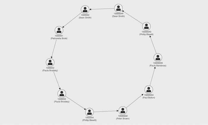
The question is, is this a helpful view for a fraud investigator?
Some crucial questions remain unanswered. How much money is involved? Who is the originator of the ring? Is there an innocent explanation for the pattern?
To answer the first question and reveal what each transaction is worth, we’ll add a simple tooltip using ReGraph’s onPointerMove event:
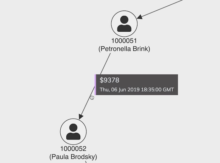
Now we have an easy way to find out the transaction value. Restricting this information to a tooltip saves cluttering the chart with too much detail, giving fraud analysts the option to display useful details only when they need it.
Adding the time dimension
To help with the other questions – who started the ring and what’s behind the pattern – we need a timeline view. So let’s add a KronoGraph visualization to the app.
You can style KronoGraph however you like: for inspiration, check out the examples in 5 popular use cases for KronoGraph timeline analysis. We’ll use a neutral white theme and add rounded corners and a subtle shadow to the containing element so that it appears to ‘float’ above the chart.
For the data model, we’ll mirror the chart nodes as timeline entities, and use the groupBy property to group accounts which share a common account holder. Each transaction is then mirrored as a timeline event, and we order the entities chronologically using the firstevent option.
We’ll also apply a bright purple highlight color to both the timeline and the chart. Finally, we synchronize the hover events in both views so that when we highlight somebody in one view, it’s also highlighted in the other. (To learn more about coupling views in a React app, see using our timeline visualization React component.)
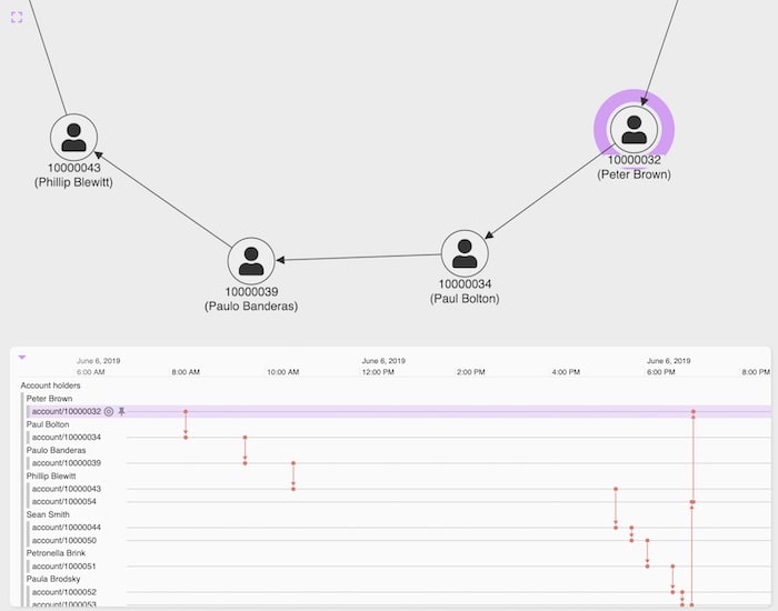
The timeline gives immediate new insight. The firstevent ordering brings one of Peter Brown’s accounts to the top of the list, and we can clearly see the sequence of transactions as money passes around the ring and, eventually, back to Peter.
Not only have we drawn out the originator of the fraud ring, but the pattern we can see also confirms our suspicions that this is not innocent behavior. The spread of events on the timeline takes place in the space of a single day – very unlikely to be a coincidence.
Building out the financial fraud detection app
We’ll add stylish UI and visual touches to make my demonstrator app more useful.
One common question we get asked is how much additional data should I bring in from the backend for context? It’s a difficult one to answer.
If we brought in, say, all of Peter Brown’s transactions, we’d end up with an awful starburst problem on the chart (think how many bank transactions you’ve made in the last year!) This is where KronoGraph is really effective. Unlike a graph visualization chart, KronoGraph doesn’t suffer from starbursts or hairballs.
In this app, we loaded a year’s worth of transactions from the members of the fraud ring into the timeline, but not into the chart. This shows us the context of the fraud ring events (red) against other events (black):
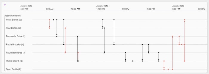
We combine the two visualizations and set KronoGraph to heatmap mode. Even with the timeline minimized at the bottom of the screen, we can still spot our potential financial fraud detection alerts as red areas and see if there’s a pattern to when in the year they occurred:
Of course, we still only show the one alert which took place in early June. Let’s consider the case where we need to manage multiple alerts in the app.
Adding multiple alerts
Another common strategy for financial fraud is a fan-out-fan-in pattern. In this scenario, the fraudster splits money into smaller amounts that fall below a certain threshold and sends them to multiple recipients who then funnel the money back to the fraudster. This pattern ensures that no single transaction is above a certain value that might arouse suspicion.
Again, ArangoDB’s AQL language makes it easy to find such patterns hiding in our graph database:
WITH account, transaction
LET accountOutDegree = (FOR transaction IN transaction
    COLLECT accountOut = transaction._from WITH COUNT INTO outDegree
    RETURN {account : accountOut, outDegree : outDegree})
LET accountInDegree = (FOR transaction IN transaction
    COLLECT accountIn = transaction._to WITH COUNT INTO inDegree
    RETURN  {account : accountIn, inDegree : inDegree} )
LET accountDegree = (FOR inRecord IN accountInDegree
   FOR outRecord IN accountOutDegree
   FILTER inRecord.account == outRecord.account
   RETURN MERGE(inRecord, outRecord))
LET maxAccount = (FOR maxDegree IN accountOutDegree
                    FILTER maxDegree.outDegree == MAX(accountOutDegree[*].outDegree)
                    RETURN maxDegree)[0]
FOR account, transaction IN 1..4 OUTBOUND maxAccount.account transaction
RETURN transaction
So how do we handle more than one alert?
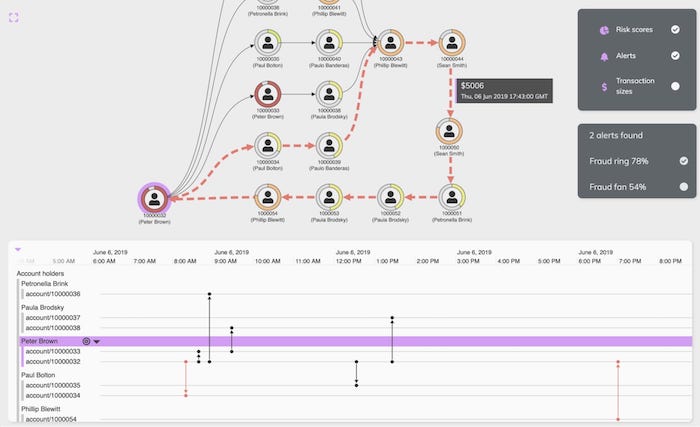
Let’s think about a financial fraud detection investigator or analyst’s typical workflow. They’re often presented with a list of alerts to review, perhaps all those discovered in the last 24 hours, and they’ll want to switch between and understand them quickly. In our app, we’ll add a simple checkbox list React component where we can turn on and off various query results:
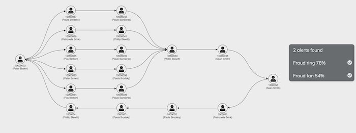
Here we see another UX challenge – it looks like my AQL queries have found a situation where a fraud ring and a fan are joined together.
You might be tempted to use a color scheme here, perhaps show the fan in blue and the ring in red. But I generally wouldn’t recommend itemizing things by color. It doesn’t scale – the human eye struggles to distinguish more than a half dozen discrete colors in a visualization, even with a helpful legend. Also, if you look closely at the bottom of the network, you’ll see that there’s a fraud ring which is a subset of this fraud fan. That means some of those links would need to be both blue and red at the same time. (For other useful tips, see choosing colors for your data visualization)
A better UX technique is to use interactions to spot the difference. Our checkbox UI means we can turn on and off the different components. Even better, we could add a hover interaction to preview the results of clicking a checkbox.
In this example we’ve used color, link width, link style and animation to make the hovered fraud pattern stand out.
Interaction designs that reveal insight
The real benefit of using a custom visualization with a multi-model graph database like ArangoDB is that there are no limits to the information you can store and the insight you can provide to your users.
Imagine that, as well as managing your transactional data, your backend is storing detailed risk calculations against every account holder. It could be useful for an analyst to see this information when assessing whether these fraud patterns are genuine.
As a finishing touch, we’ll add a control panel React component so that the user can visualize a risk score using ReGraph’s donut feature. These allow you to display relative data values as color-coded node borders, providing an at-a-glance understanding of volumes relating to each node.
Now we can spot that it’s not just the timing of the fraud ring that’s suspicious. This fraudulent activity also involves several people with higher (orange) risk scores. We can see that Peter Brown has a high (red) risk score which makes him a definite person of interest.
Visualize financial fraud detection with ArangoDB data
The combination of a powerful graph query language like ArangoDB’s AQL with flexible data visualization tools like KeyLines, ReGraph and KronoGraph is compelling. We’ve shown how the results of an AQL query can be brought to life with some simple techniques like interactions, styling and timeline analytics.
Want to read more about integrating ArangoDB with our graph visualization SDKs? Read our KeyLines-ArangoDB integration tutorial.
Share:
