In this blog post, we demonstrate how to use network visualization and forensic timeline analysis to make sense of complex, high-velocity network traffic.
Why forensic timeline analysis?
The computers and internet-enabled devices we use every day have a ceaseless torrent of network packet data running in the background. The numbers are incomprehensible – some estimates put global IP traffic in the order of tens of exabytes per day (one exabyte being 1,000,000,000,000,000,000 bytes).
Each IP packet contains data arranged according to some protocol, such as Transmission Control Protocol (TCP – used by website browsing and email), User Datagram Protocol (UDP – used in video conference calls), and a whole raft of proprietary formats that connect our devices.
Whether for network monitoring and performance management, cyber security or lawful intercept intelligence, analysts need to make sense of this traffic fast. But it’s a daunting challenge – how do you reveal insight from such vast amounts of densely-connected data?
They rely on network or link analysis to understand the relationships behind the data, and forensic timeline analysis methods to reveal the exact sequence of data points.
Let’s create an example dataset of network traffic for our demo.
Modeling 15 seconds of IP data
The Wireshark protocol analyzer is one of the best-known tools for collecting network packet data. To get a feel for the scale of the data visualization challenge, I ran the tool on my own laptop for just 15 seconds – enough time for me to visit the homepage of our Connected Data Visualization Consortium.
-
- entities are unique IP addresses, ideally resolved to a host name (a service Wireshark helpfully provides)
- events correspond to individual communication packets between these addresses, whether TCP, UDP or anything else
Now I load the model into our KronoGraph tool for forensic timeline analysis.
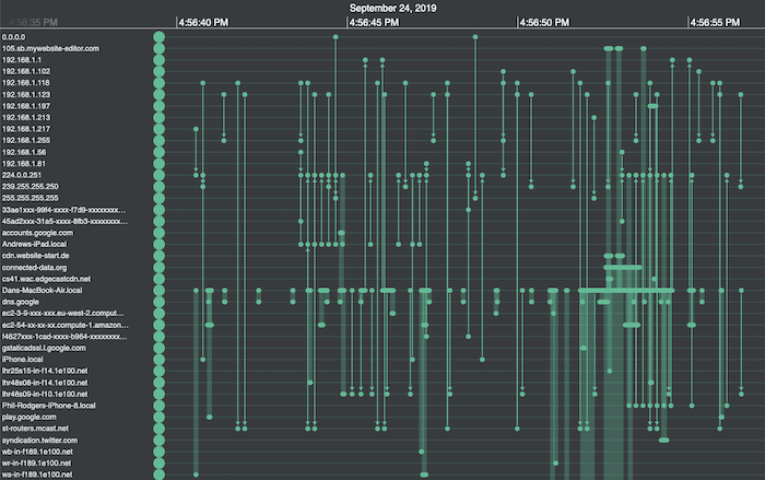
I can spot a few encouraging patterns – for example, the busiest row halfway down the list corresponds to my own laptop (Dans-MacBook-Air.local). But really, it’s a bit like trying to read the Matrix. We can do better!
Ordering & styling timelines
Thanks to IP address resolution, I can distinguish between external websites and addresses on my network, corresponding to various routers and endpoints. They include my colleagues Phil and Andrews’ Apple devices, which seem to be chatting with my laptop without my knowledge.
Here’s where KronoGraph’s custom styling options come in handy. I can set my forensic timeline analysis app to:
-
-
- colour my own laptop yellow, external websites blue, and internal addresses green, and group them into separate categories
- re-order entities to minimize the overall length of the event lines, making it much easier to spot connections
-
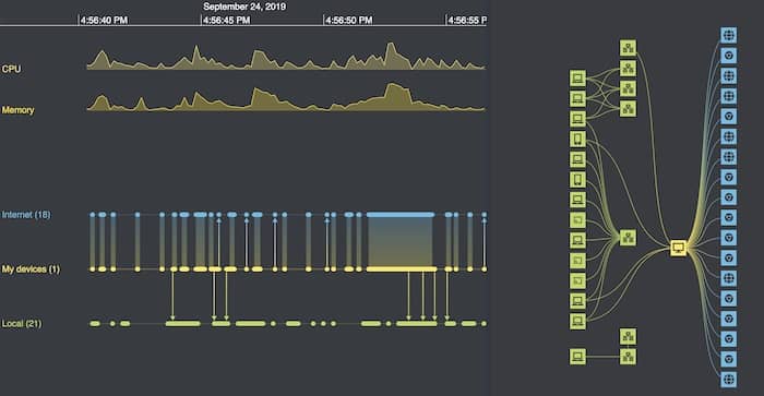
Here’s the result:
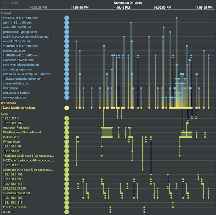
Much neater – in the top half of the picture I can now see which external sites I’m talking to. In the bottom half is the other internal network traffic that my network card is picking up. Much of it is between other devices on the network that aren’t directly connected to my machine. Some of it occurs in regular bursts, but it’s clear now that none of it is directly related to my website visit.
Aggregating data for clearer analysis
Another neat feature is the ability to aggregate dense bursts of events into single bands.
With this kind of data, where there can be bursts of hundreds of events per second, there’s no value in drawing an arrow for each packet. Instead, KronoGraph creates event summary bands. Investigators carrying out forensic timeline analysis can zoom in to reveal the individual events, but keep clutter to a minimum the rest of the time.
Exploring details without losing the bigger picture
Another useful way to interact with the chart is by switching to lens view. The lens holds a virtual magnifying glass over key items of interest, but does so in the context of the entire chart. Users can still see the full dataset while they’re scrolling back and forth through each timeline to reveal the hidden details that are relevant to their forensic timeline analysis.
Time series charts for continuous data
When you’re analyzing individual events in a relentless stream of time-stamped data, it’s important to see them in context. We can do this easily by adding time series charts to the timeline.
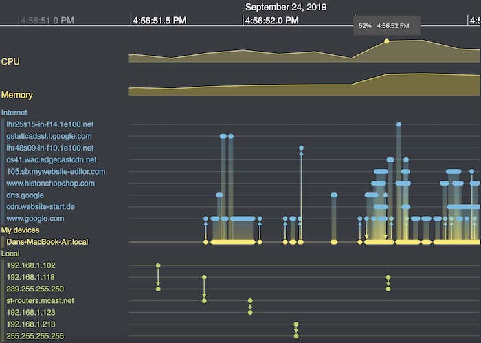
At the top of the timeline of Wireshark packet data, I’ve overlayed continuous CPU and memory data from my laptop. Right away we can spot a big uptick in activity about three quarters of the way along, when I first visit the CDVC website. The chart’s useful tooltips give me more precise information.
Time series charts update every time you interact with the timeline. When I zoom in to take a closer look at a cluster of events, the charts adjust simultaneously.
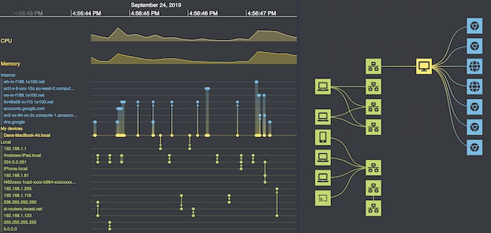
Visualizing the network topology in our timelines
The timeline shows every event picked up by Wireshark in sequence, but hiding within it is a network topology. Which addresses are directly connected? Is there a hub-and-spoke nature to the packet flow or can it follow multiple paths?
This is where graph visualization comes in.
KronoGraph integrates seamlessly with our graph visualization toolkits, providing two powerful views of the same data. Here we’ll use KeyLines (our JavaScript SDK) but we could just as easily use ReGraph (our toolkit for React developers).
[For integration details, check out Integrating a KronoGraph event timeline visualization with KeyLines.]
I’ll create a visual graph model for my data, where:
-
-
- entities on the timeline correspond to nodes in my graph, with similar styling
- events between the same two addresses are mapped to a single link in the graph, with a stylish color gradient design
- nodes are given an additional tier property based on whether they are endpoints in my local network, part of my office’s network (routers, etc.), my own laptop, or an external website
-
I then load this model into KeyLines and apply a sequential layout, one of many automatic graph layouts available. This uses the tier properties I added to arrange nodes into distinct levels.
The sequential layout is ideal here. It shows me the shape of the network within the context of a hierarchical architecture model.
Here’s the graph next to my timeline:
Powerful interactivity
This is where the magic happens – extending our forensic timeline analysis tool to a fully-interactive hybrid data visualization application. I use the KeyLines and KronoGraph APIs to code up some neat interactions.
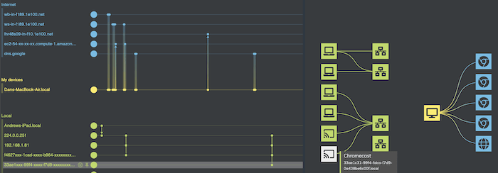
First, zooming or panning the timeline filters down the network to just the addresses involved during that time window. With a single marquee drag, I can focus solely on the time my laptop was talking to the CDVC website.
From the list on the top left I see which sites were triggered by my CDVC visit. They include website content from a 3rd party CDN, and various Google sites.
To make things easier to read, I add further interactions:
-
-
- hovering over any portion of the timeline highlights the relevant paths in the network in white
- hovering over any item on the network brings up a tooltip with more info and highlights the corresponding actor in the timeline
-
Now I can really play around and understand what’s happening. I discover that some of the traffic is caused by Chromecast devices around our office talking to the local network. Interesting, but entirely unrelated to my browsing activity.
I also notice a lot of traffic to an AWS ec2 instance at the same time as my visit. It’s worth investigating this further.
With the AWS ec2 instance in focus, I use another neat KronoGraph feature that pins the timeline so I can compare the two timelines more easily. Now I zoom out of the AWS ec2 instance to show all of its activity. From this detailed view, I can see that requests to this service by my machine (the five thinner bars) occur regularly, and are not triggered by my visit to the website (the thicker bar).
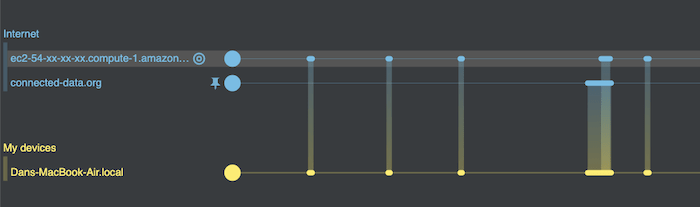
Establishing cause and effect – or in this case the absence of it – is one of the most powerful arguments for adding a timeline to any investigative tool.
What our forensic timeline visualizations revealed
In just a few minutes of looking at the data with our network visualization and forensic timeline analysis tool, I found insights to help my mental picture of what’s happening on my machine. From a JSON dump of packet data, my simple interactive visualization quickly revealed:
-
-
- the high level picture of what connections are happening: locally and externally
- the cause-and-effect context to understand what network activity was caused by my actions, and what was happening in the background
- the volume of background activity that happens on my laptop, and some of the reasons why it’s happening
-
Not bad for fifteen seconds of information!
To find out how forensic timeline analysis and network visualization can help you, or to request a free trial of KeyLines, ReGraph or KronoGraph, contact us
Share: