
A customer knowledge graph is an efficient, powerful way to manage and analyze your customer’s data. In this blog post, I’ll show you how visualize one and use analysis techniques to get a deeper understanding of your customers.
I spend a lot of time analyzing data from multiple sources to find out what attracts people to our website. Whether it’s a tweet, an email or a Google advert, those who kindly give their consent for tracking marketing preferences help us understand what’s performing well.
Analyzing this data gives me some idea of the problems facing our customers, particularly those working to understand customer 360 business insight and ‘know your customer’ regulatory compliance. What’s the best way to find out how your customers engage with your brand, or who they’re doing business with? How do their relationships evolve? As organizations generate more data than ever before from multiple sources, how do they make sense of it?
Our graph visualization toolkit technology can help. It brings any connected data to life, and it’s a particularly good fit for large, complex networks of customer data stored as knowledge graphs.
I decided to integrate multiple data sources into a single customer knowledge graph of anonymized marketing data, and visualize it using KeyLines. We’ll find out which marketing channels are most effective at encouraging contacts to our site and try to understand the behaviors of those contacts who eventually become customers.
What is a knowledge graph?
Since Google introduced one to enhance its search engine’s results, knowledge graphs have become the most popular choice for storing structured information in a semantic way. There’s no agreed definition, but we can think of them as tools to understand related knowledge and information. All knowledge graphs share certain traits:
- Size – they’re large networks of connected, real-world entities
- Ontology – they feature semantic modeling of knowledge: think of it as a dictionary of descriptive terms we can use to link things
- Integration – they collect information from a variety of external sources
Knowledge graphs are everywhere and lend themselves to so many use cases. They power everything from knowledge bases to academic research databases, risk management software to supply chain management tools and so on. The next step is to visualize these online libraries of connected entities so it’s easy to manage and explore the data.
Our knowledge graph data model
The first rule of data modeling is to understand what it is your users want to achieve.
In this knowledge graph use case, we want to focus on which marketing channels are most effective at reaching our audience and attracting them to our website. We’re interested in where our audience is based, how interests evolve over time, and where they currently exist on the ‘lifecycle’ that could take them from marketing contact to Cambridge Intelligence customer.
We’ve used a subset of our marketing, sales and web analytics data taken from our HubSpot marketing automation tool API.
Our simple schema features:
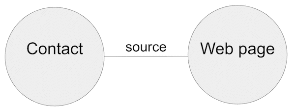
- Nodes representing webpages and marketing contacts.
- Links between nodes representing the first webpage a contact visited.
- Properties on contact nodes featuring the time they visited the webpage, their geographic location, where they are on our lifecycle that tracks their journey from contact to customer, and the marketing channel that attracted them to the site (more on these channels later).
Tidying up the customer knowledge graph data
It’s not a good idea to throw an entire customer knowledge graph at your analysts without filtering out the data they don’t need or consolidating duplicates.
In our dataset, there are multiple URLs for the same webpage because of essential redirected pages or additional codes for tracking web traffic. We removed those tracking parameters and grouped the same URLs together.
We’re also only interested in analyzing website activity, so we filtered out everything else. This means we can focus on six marketing channels:
- Organic: contacts find us through online search engine results.
- Email: contacts click on a link from an email we’ve sent them.
- Paid: contacts click on an online advert.
- Referral: contacts visit our pages via a third party site, maybe through a link on the site of one of our Technology Alliance partners.
- Direct: contacts reach us without going through a referral, perhaps by typing our web address straight into their web browser.
- Social: contacts click on a link from Twitter, Google My Business, LinkedIn, etc.
Now we’re ready to load the data.
Visualizing our customer knowledge graph
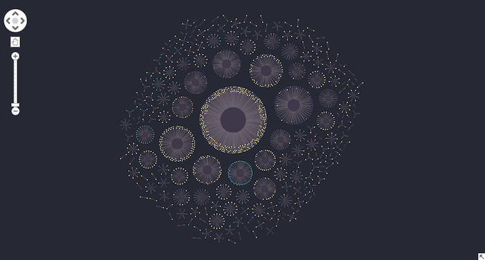
We’ll display our knowledge graph using KeyLines, our graph visualization toolkit for JavaScript developers. Here’s the entire dataset displayed using our automatic organic layout:
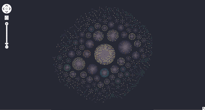
In each component, the central node is the first web page visited by the connected contact nodes around the edge. Notice how the organic layout positions more densely-connected nodes at the center, making it easy to spot right away which web pages are most popular.
We’ve used KeyLines’ custom styling feature to color-code contact nodes depending on which marketing channel attracted them to the site.

Even at this zoom level, we can see how contacts found the most popular web page using organic methods, predominantly search engine results.
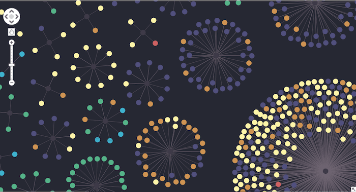
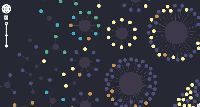
Zooming in, we can see other pages were almost exclusively reached by either direct marketing channels or referrals:
Finding influential nodes with degree centrality
KeyLines comes with advanced social network analysis centrality measures. They help us reveal the most important nodes in a network and gain a better understanding of how the network interacts.
We’ll use degree centrality to find the highest number of links to other nodes in a network. In a network of people, this is an important indicator of who is strategically well-placed. In our data, it’ll identify which are the most influential pages, and help us decide where our most important information should go.
The result gives us a similar picture to the first image we saw, but this time the 11 popular pages outside the obvious one in the center are more prominent. The contact nodes are more concentrated too, so it’s easier to spot the most popular channels.
Identifying patterns and outliers
It’s important not to focus solely on the biggest and loudest parts of your graph visualization. In our chart, examining some of the smaller components and outliers can reveal patterns and insight too, such as which channels aren’t performing or which pages aren’t attracting enough interest.
Our marketing strategies use multiple channels to reach more than one type of target audience. When we zoom into the chart we can see which channels complement each other.
Notice how direct and referral channels perform well together for some pages, but for others, paid and organic channels work better in isolation.
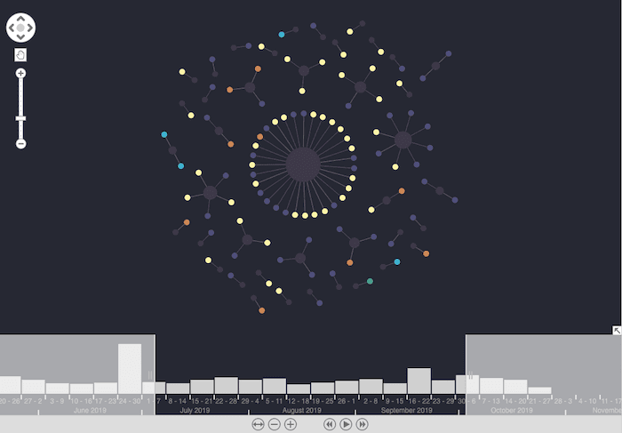
Time-based analysis
The powerful time bar component lets us analyze the evolution of individual marketing channel performance and interest in specific pages.
We know that fewer contacts visit the site around summer vacation season, but it’s useful to know whether that’s evenly split across all marketing channels. Are people still checking emails or reading social posts away from the office?
Knowing how contacts behave over time lets us adapt our strategy and deliver the information they’re genuinely interested in via a channel that’s right for them.
Filtering by geography and lifecycle stage
Our toolkit technology comes with many other slick features. Advanced filtering options give analysts the power to focus on the parts of the network they’re really interested in. With complete freedom to define their own filter logic, it’s a great way to make sense of huge networks like customer knowledge graphs.
Using a range of filters in combination is great at reducing noise in the graph.
We’ll use the geographic location on each node to discover different patterns for different regions. Do some marketing channels perform better in the US compared with Europe? Are certain pages more influential in different regional audiences?
We’ll combine this with another filter – the lifecycle property that tracks their journey from marketing contact to Cambridge Intelligence customer. Let’s focus on US-based contacts.
This visualization helps us understand which channels and pages are more likely to encourage these regional contacts to complete the lifecycle successfully. Revealing changing behaviors can help us plan more effective interactions with our contacts, and tailor more effective marketing campaigns for different parts of the world.
What’s the next step?
We’ve kept things simple here by using a single customer knowledge graph containing structured data. You could easily visualize multiple knowledge graphs to gain more varied insight about your customers. You could also power our graph visualization with a natural language processing (NLP) algorithm to extract semantic and contextual knowledge.
We’ve also demonstrated a subset of the analysis techniques our toolkits offer. Check out the many other advanced features available.
Ready to visualize your own knowledge graph use case?
Once you see how our graph visualizations can bring your data to life, you’ll want to find out more. Simply request a free trial, or contact us to talk through your project plans.
Share:
