How much data can your users handle? When you’ve got a graph database packed with complex connected data and a high-performance, graph visualization application, it’s tempting to render it all on screen at once and expect the analysts to make sense of it.
No matter how experienced your users are, making them wade through data to find hidden insights takes up valuable time and effort. They need to understand the key relationships in their data and make decisions fast.
There’s a similar problem when choosing how to present the feature-rich options your visualization application should support. Our toolkit technology comes with built-in advanced options including social network graph algorithms, powerful automated graph layouts, and visual time analysis, but bombard users with too many choices at once and you make their job harder.
This post describes how to create visual models that deliver the best user experience (UX). With detailed graph visualizations from an insurance fraud investigation, you’ll see how keeping things simple is the key to success.
The insurance fraud dataset
The data contains a fictional but typical representation of vehicle insurance claim data. It includes links between nodes representing policies, policyholder details, insurance claims, vehicle damage, doctors, witnesses and mechanics. Here’s the entire dataset:
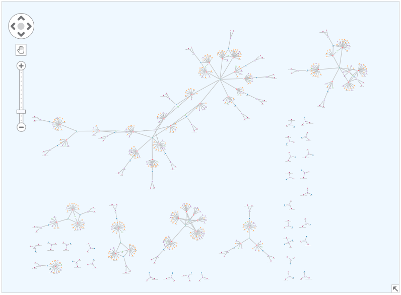
To the right and along the bottom, notice the individual Y-structures of policies without a claim.
If we zoom in, you can see the more complex components represent policies that had at least one claim made against them.
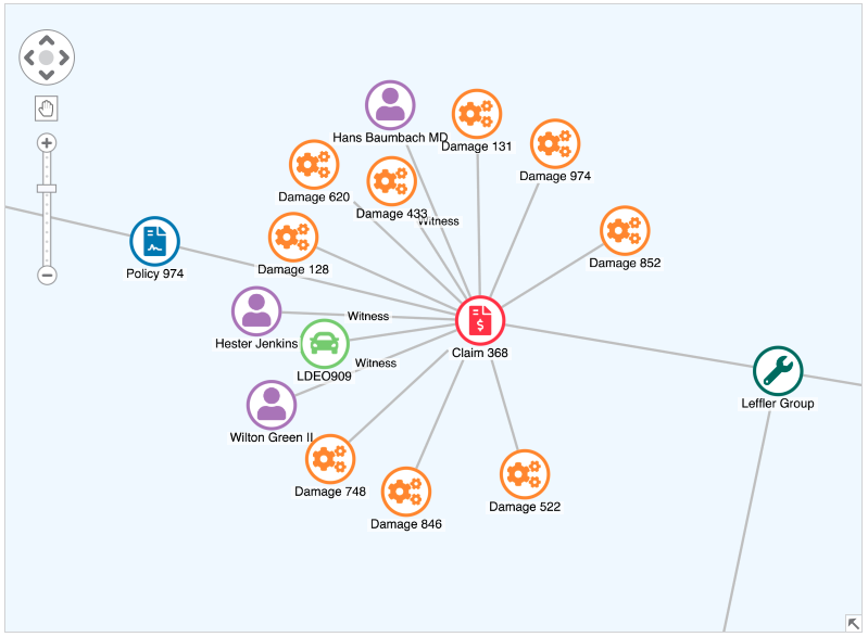
We could keep moving around the chart to try and understand the data, but analyzing the entire network in one go can be overwhelming and time-consuming, making it hard to find true insight.
There’s a much simpler way that’ll make life easier for your users.
Design the model your users want
To get the data and visual models right, it’s important to speak to your users and find out what insight they need.
Based on research from analysts, we’ve designed four different visual models of our insurance fraud data for them to choose from:

Providing only four options may seem like a radical step when our toolkits are packed with powerful functionality and customizable options.
Users are still benefiting from those features, but you’re making some difficult decisions for them. Developers do the modeling in the back end instead of expecting users to do it on the chart. They don’t have to work out which social network algorithms to run, or which of the eight layout options work best in each scenario.
It means users get the versions of the data they need and can focus on identifying the patterns and anomalies that might suggest fraudulent practices. If they’re new to graph visualization, it greatly reduces the learning curve too.
Let’s take a closer look at the views we’ve designed.
Use graph algorithms to reveal connections
Notice that there are multiple people linked to the claim in the image above. If we remodel the data to only consider people who share 1st or 2nd-degree connections through claims and policies, we gain a new perspective.
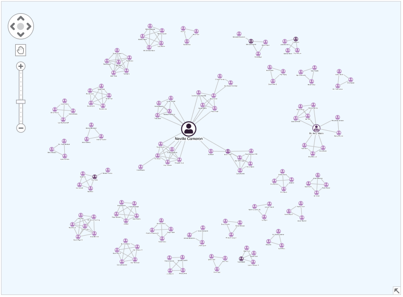
Under the hood, this view uses the betweenness centrality measure and sizes individuals based on how well connected they are.
Typical insurance claims feature small, isolated clusters of people. Analysts will want to understand why those larger nodes representing highly-connected individuals are involved in multiple claims. Could they be fraudulent witnesses?
Visualize damage types to identify patterns
This view gives users an easy way to find hidden insight in behavior patterns.
There are usually different types of vehicle damage, but some accidents are more common than others. If a mechanic is fixing a disproportionately high number of issues affecting a specific vehicle part, it could be worth investigating. It may be a sign of claim inflation – a big problem in the automotive insurance industry – where policyholders claim for more damage than actually occurred.
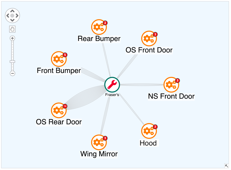
In this example, we’ve grouped damage claims by type using our toolkits’ combos functionality. In the backend system data, Fraser’s mechanics has fixed many more offside rear door claims than anything else. We bring this data to life using multiple links and glyphs.
Some fraudulent mechanics may get lazy and pick the same damage every time they’re inflating claims. Bringing this to your users’ attention quickly and easily helps them detect potential malpractice.
Find unusual behavior in distances traveled
Another useful way to view the data for suspicious activity is to look at how far individuals are traveling from their home addresses to get their vehicles repaired.
Using map mode, which displays our network on a map, we can examine policy holders and their connections to mechanics through policies and claims.
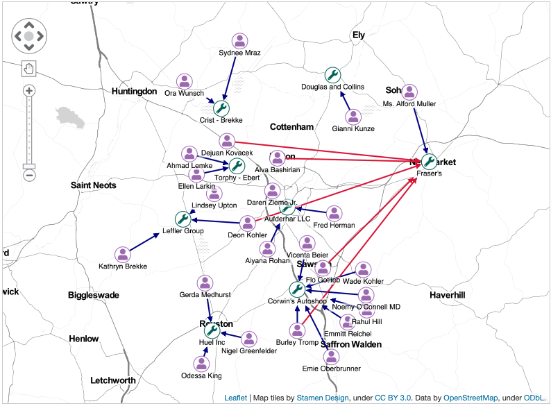
From our analysis of damage types, we know Fraser’s mechanics was associated with an unusually high number of claims involving one specific vehicle body part. This map view shows that several claimants traveled significant distances for repairs at Fraser’s, even though there were shops much closer to home.
Our technology uses advanced algorithms in the backend to identify and highlight potentially suspicious links. Is the shop colluding with these customers to inflate claims?
Need help designing the right visualizations?
Whatever industry you’re in, smart data and visual modeling can be the difference between an average user experience and a great one. But getting the model right isn’t easy. That’s where our support comes in.
We help customers design better interactions for their users every day. If your users are drowning in too many connections, or complaining that your software is too complex to work with, our experts are at hand. Get in touch with us and we’ll help you design the best-in-class graph visualization for your customers.
Visualize your own data
Understanding what your users need is the first stage of data and visual modeling. Using our advanced toolkit technology, you can then build graph visualizations that’ll help your users work efficiently and effectively.
Our flexible KeyLines and ReGraph toolkits feature interactive demos, including this insurance fraud example. Ready to get started?
