The ultimate guide to graph visualization
Everything you need to start designing your best graph visualization application.
This blog post explores some of the graph and timeline visualization capabilities you’ll need to consider when building a blockchain analysis tool.
But first, what is the blockchain?
At its simplest, the blockchain is a shared digital ledger – a store of transaction information. The ledger is decentralized and distributed, meaning every node on the network stores and maintains its own copy. New and existing data added to the ledger is validated by a unique string of text (called a cryptographic hash), making it tamper-proof and immutable.
It’s a novel and very secure way to store and share data. Its most popular application so far is as the engine behind cryptocurrencies, like Bitcoin and Ethereum, but it has much wider use cases ranging from supply chain logistics to medical record management, digital marketing to real estate.
There’s a misconception that, because the blockchain is transparent (everyone in the network can view each transaction) and secure, it’s easy to investigate. That isn’t the case.
Untangling blockchain data to understand the underlying activity is a mammoth task. As the global blockchain technology market grows, so does our need to manage and make sense of what’s happening to millions of digital assets.
In this post, we’ll focus on the cryptocurrency use case, but the concepts apply to any scenario where a person needs to interpret complex blockchain data to make an informed decision.
According to coinmarketcap.com, the global value of cryptocurrencies is between 2 and 3 trillion USD. And wherever you find currency, you’ll find criminals trying to exploit vulnerabilities.
Blockchain analysis tools are sophisticated platforms that help analysts connect actors and transactions to real-world identities, usually to understand suspicious activity.
Governments, banks, virtual asset service providers (like cryptocurrency exchanges) need a way to uncover the people behind the alphanumeric strings. You can read more about who needs to analyze on-chain activity, and why, here.
Before meaningful analysis can happen, analysts need to understand the entities and transactions in their data. This generally happens in three phases.
The first is address classification. This aims to connect pseudonymous blockchain addresses to real-world entities. Raw blockchain data is enriched with information from other sources, like web scraping or dust attacks, and algorithmically clustered to group addresses most likely to be associated with a single controlling entity.
Next, transaction risk scoring assesses the connections between the entities. It uses machine learning to assess each individual transaction on the blockchain and assign it a risk score, based on factors like origin, wallet history and money flow.
The third step is investigation. Here, analysts use sophisticated visual tools to dig into their newly enriched data. This is where graph visualization plays a critical role.
Blockchain data is big, fast, complex and full of connections. Investigating it requires specific graph visualization and visual timeline analysis capability.
In no particular order, here’s our run-down of 9 bits of functionality you’ll need to supply.
The key to any blockchain data investigation is understanding what happened, when.
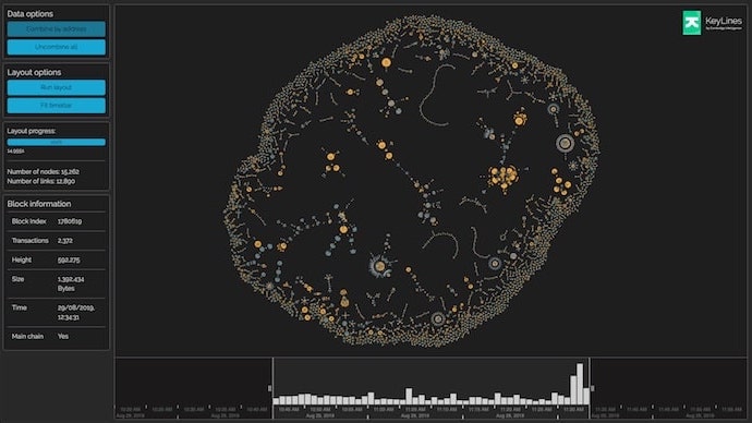
As a starting point, you’ll need to provide both a graph and a timeline view. Integrated together, the investigator sees the entities involved in each transaction and the order in which they happened. Filtering in one view updates the other, so the investigator can explore activity in multiple dimensions simultaneously.
On an average day, the Bitcoin blockchain facilitates over 250,000 transactions, in blocks of around 4000. The data involved in blockchain analysis is big and grows quickly. There are many techniques for bringing big graph data down to a useful scale, but a key one is filtering.
Investigators should be able to filter data based on any attribute they want, from transaction size, wallet ID, risk score or by time.
Even a filtered blockchain dataset is likely to be huge. Automated layouts are another powerful way investigators can start to detangle big and complex blockchain data.
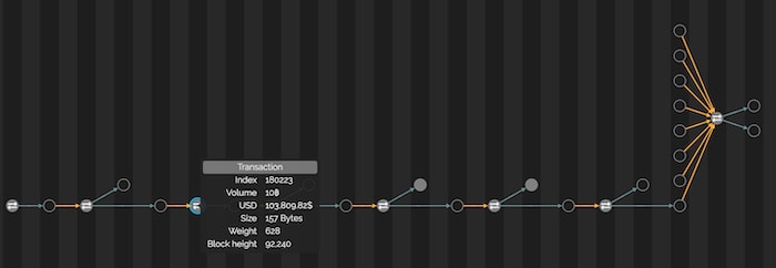
Some essentials are a powerful force-directed layout to display the full network, and a sequential view to detangle long strings of transactions.
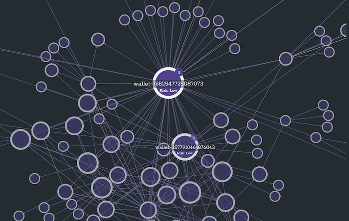
Incorporating node sizing, either graph analytics measures like degree centrality, or individual node attributes, like wallet balance, helps the investigator identify individuals playing the most important role a blockchain network.
It’s cryptocurrency best practice to create fresh addresses for each transaction and spread funds across multiple wallets. These precautions help ensure anonymity and reduce the risk of funds being stolen, but they also frustrate investigators.
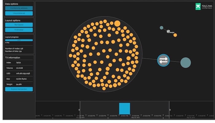
Address classification goes a long way in tidying up the dataset, but they’re never 100% accurate. Investigators need a way to manually combine different addresses, and dive into automatically combined ones, as investigations progress.
Graph visualization UX is its own topic, but a fundamental principle is to avoid overwhelming the user. Show them only what they need to see, but give them the tools to explore at their own pace.
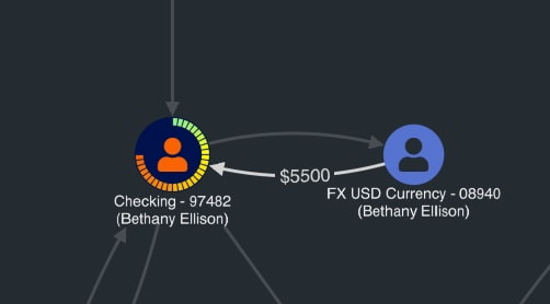
With techniques like tooltips, link styling and donuts you can add risk scores, wallet balances, transaction amounts, compliance flags, and any other attribute to the chart, while keeping a clean and clear user experience.
Time series charts help investigators pinpoint events like cash-outs or large-scale transfers, or add additional contextual information like bitcoin pricing, to show the rise and fall of the market.

If we’re putting the investigator in the driving seat, we need to help them drive.
A common investigation approach is to start with a small sample of data – perhaps just a single blockchain address – and bring in more data incrementally to build a bigger picture.
This ‘land and expand’ approach requires a host of graph and timeline visualization features. Adaptive layouts to add new data in a useful way to make this happen. An undo/redo stack provides easy reversibility when the investigator finds a dead-end. There’s also node selection, or entity pinning, to help isolate specific on-chain activity.
Animation is an easily forgotten but essential part of a good blockchain analysis tool. With each layout, expand, filter or timeline zoom, there’s a risk of the investigator losing their train of thought or point of interest. Smooth animation keeps them on track.
Intelligence is useless if it’s not shared. Whether it’s a law enforcement agent investigating darknet trading, a VASP performing AML checks, or a financial institution filing a suspicious activity report, the investigator will want to share their findings with somebody.
The ability to export charts, either as image files or custom PDF reports is a key part of their workflow.
Big data visualizations require serious graphics rendering power. Investigators won’t want to stare at a loading screen for long (or watch their visualization crash).
If your blockchain analysis tool is to succeed, you need a high-performing renderer, like WebGL. Other, simpler, approaches like SVG, simply fail to work as the data grows.
Building a graph and timeline visualization component for a blockchain analysis tool can be a complex and time-consuming process. One way to make it faster and simpler is with our data visualization SDKs. Request a free trial to bring your blockchain data to life.