The ultimate guide to graph visualization
Everything you need to start designing your best graph visualization application.
Wherever you are on the political spectrum, most of us assume financial backers stay loyal to their chosen candidate or party in the run up to an election. I thought so too, until I started to investigate America’s latest election campaign data.
In this blog post, I use graph visualization technology to turn seemingly mundane US Federal Election Commission (FEC) data into interactive charts that hold fascinating insights.
In the US, candidates rely on financial backing in federal election campaigns. It’s common for some of that financial support to come from tax-exempt interest groups called Political Action Committees (PACs). Each committee raises campaign funds and distributes them to candidates who support particular political interests or ideologies.
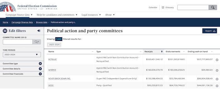
PACs have to register with the FEC and comply with strict rules around how much they can donate to candidates, political parties and other lobby groups. The federal commission also publishes PAC donations online, so you can browse through a table listing thousands of active committees and investigate their contributions.
Fortunately for us, they also provide a CSV file of PAC donations. Our toolkits work with any data source, which means we can carry out visual network analysis of these donations – a much more effective way to spot unusual connections and patterns.
I kept the model simple:

Our data visualization toolkits are designed to create web applications for visualizing graph data, but you can also use them as one-off visualization tools for single datasets. In this case, I set up a simple application locally, on my laptop, and loaded the CSV into memory. Let’s see what the entire dataset looks like.
When I display the entire dataset in an organic graph layout, the overall structure immediately paints a vivid picture.
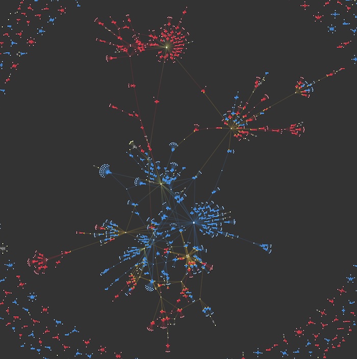
The yellow nodes at the center of each cluster represent PACs who donated.
The polarized nature of American politics shows that these contributions are usually made to either Democrat or Republican campaigns. That’s not surprising – you’d expect a PAC called Biden Victory Fund to donate to the Democrat cause, just as you’d anticipate the Republican National Committee to back their Republican candidates. There are also smaller components at the periphery of the chart representing donations to candidates along distinct party lines.
But even at this zoomed-out view, I spot something worth investigating further. Some large, prominent clusters contain both blue and red nodes. There are clear links from certain PACs to both Republican and Democrat candidates, despite them being at opposite ends of the political spectrum. Why is that? Let’s dig deeper into those connections.
I used advanced node styling capabilities to customize the candidate nodes with the most important details. Adding these to the nodes means I don’t clutter the chart with unnecessary information, but I can zoom in and see a candidate’s party and full name immediately. I could even add a photo, but I’ve kept things simple and used the familiar donkey vs elephant logos for each party.
I zoom into a cluster near the top right of the chart to reveal something interesting:
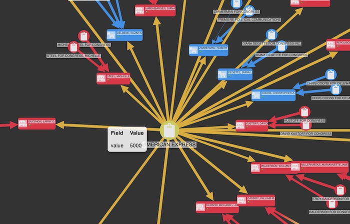
American Express’s PAC (AXP PAC) donated to both Democrat and Republican causes. Why is that? Their website says that they use a variety of factors for making political contributions, including:
For full details, see the American Express Company Political Contributions Report
So geographical location, as well as financial management legislation and policy, can influence where donations from AXP PAC go, regardless of which party that candidate belongs to.
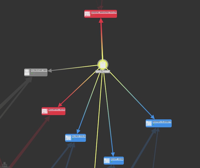
Another surprise cross-party connection in the chart was MailChimp. They provide a bridge between Elizabeth Warren (far left Democrat) and Kevin McCarthy (far right Republican).
What commonalities or interests could these two candidates possibly share that would result in such a connection? By exploring the graph in this way, I discover hidden links that are worth investigating further.
My investigation revealed other strange patterns of activity in our network, such as why certain candidates receive more PAC donations than others, and what they may have in common.
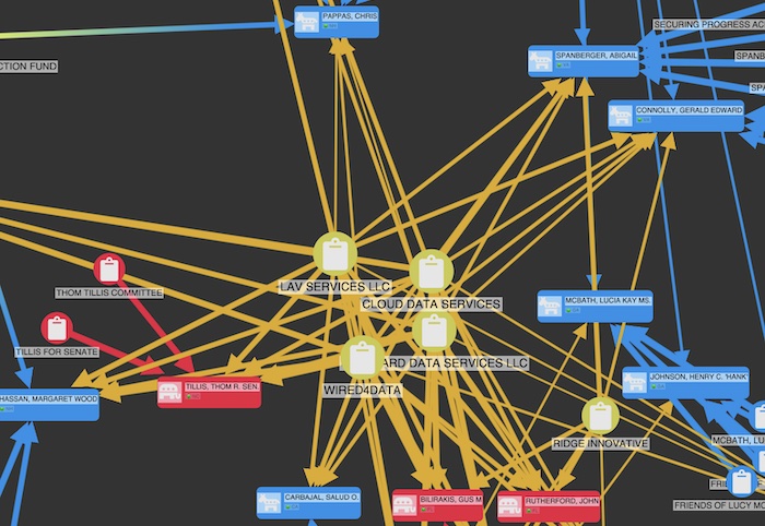
I spotted five PACs, all with ambiguously generic names, who were densely connected to the same handful of congress members.

This sent me down a rabbit hole. Googling revealed that these are so-called “scam PACs” owned by Richard Zeitlin, who at the time of writing is awaiting trial on charges of fraud, obstruction of justice and conspiracy. He ran telemarketing companies which allegedly defrauded donors who believed they were giving money to charities, not political causes
What has happened to these companies’ campaign contributions? And why donate to these specific candidates? Are they aware of these connections? Again, graph visualization reveals surprising insights from connections that would have been almost impossible to spot by scrolling through the PAC tables. Visualizing those connections brings them to life.
I’m not an investigative journalist. If you are, feel free to reach out to me – I’m happy to share my visualizations and curious to see where this leads.
The lesson I’ve learned from exploring this data is that you can apply graph visualization to all kinds of datasets, even tabular data that might not immediately present itself as a graph. Those unlikely graphs can often tell interesting stories. See my article on visualizing graph data without a graph database
You can evaluate our tools for free. Just request a trial to start building your own interactive visualizations!