Wherever there is data there are data quality issues.
A common challenge faced by our customers is how to clean their data so that it’s a reliable source for analysts and end-users to explore. Data cleansing is the process of finding and fixing data problems such as duplicates, inaccuracies and inconsistencies. We previously explored the impact data quality has on network visualizations in our snowstorm blog post.
The first step in the data cleansing process is understanding where data quality issues exist. In this blog post I’ll use graph visualizations to find three of the most common data quality problems in a real-world global terrorism dataset.
About the terrorism incident dataset
Our case study uses the RAND Database of Worldwide Terrorism Incidents, which contains data on over 40,000 terrorist incidents that took place between 1968 and 2009.
Just to be clear, we’re not suggesting that this database has a quality problem or contains ‘dirty data’. On the contrary, it’s an extremely comprehensive and valuable resource. But no large dataset is perfect. Even in a reputable and trusted database you need to check the facts carefully before drawing conclusions.
For each terror incident, the database captures information on location, perpetrator, and number of injuries and fatalities, as well as a detailed description of the attack.
As a CSV file it takes up 14Mb on my computer: that’s small by big data standards but still too big for a human to process.
I want to see if using KeyLines or ReGraph, our graph visualization toolkits, can help me find some data quality issues. Are we looking for needles in a haystack? Let’s find out.
The graph model
I’m not following a set formula here, but I start out with what feels like an intuitive way to represent the data – by country and region. My model is simple: nodes are countries, and I place a link between two countries if they have both experienced a terror attack carried out by the same perpetrator group.
The first step is to parse the data into KeyLines and generate the nodes. I size them by the number of attacks, and color them by world region. To keep things simple, I filter the data to just include major incidents, which I define as attacks with at least one fatality. Here’s the result, using our circular packing layout feature.
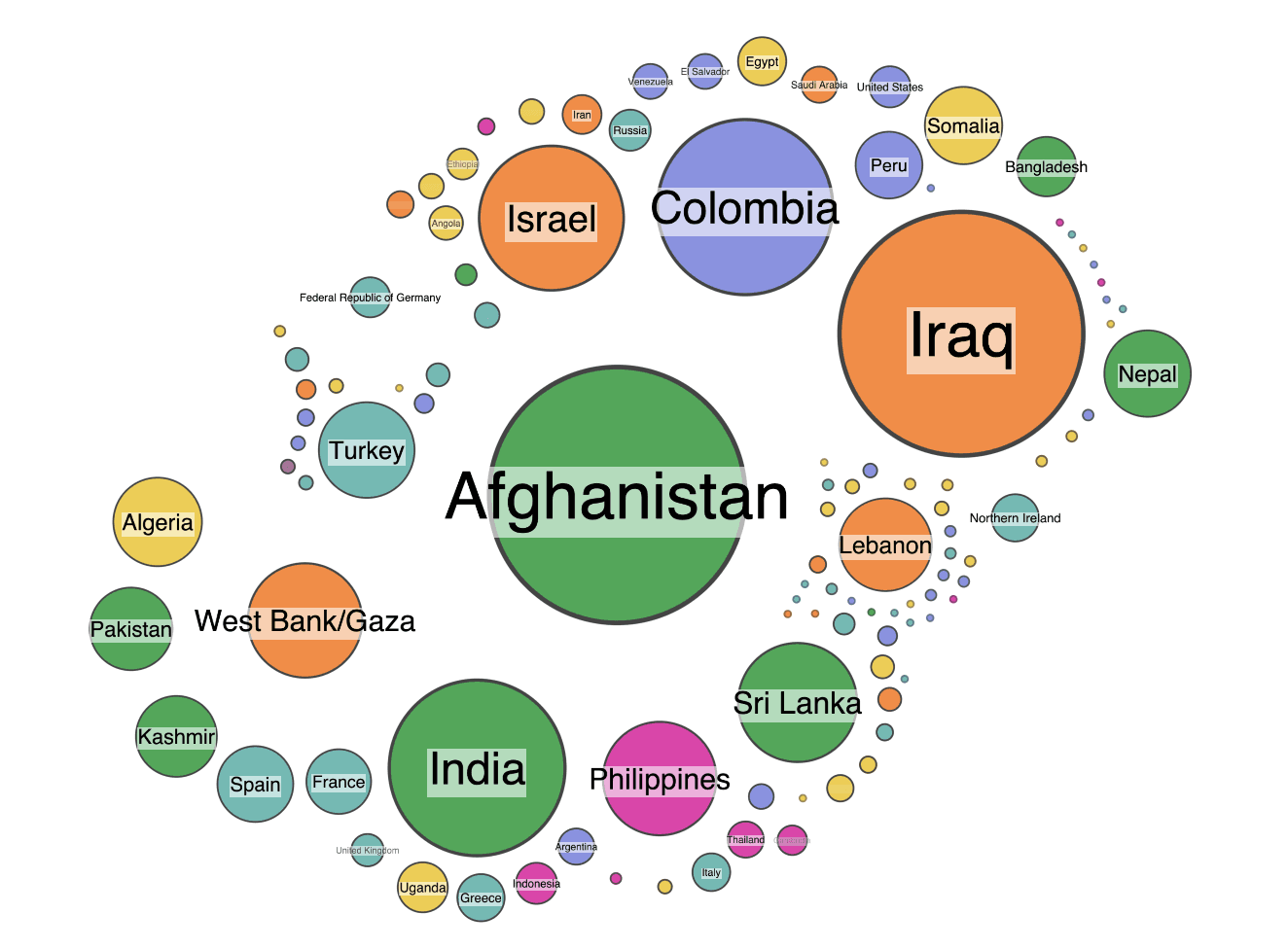
First sanity check – do the node sizes make sense? At a glance, I think they do. The largest nodes are countries that have experienced significant terrorist activity. The fairly even spread of colors is interesting – nowhere in the world is safe from terrorism.
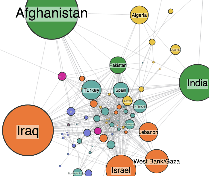
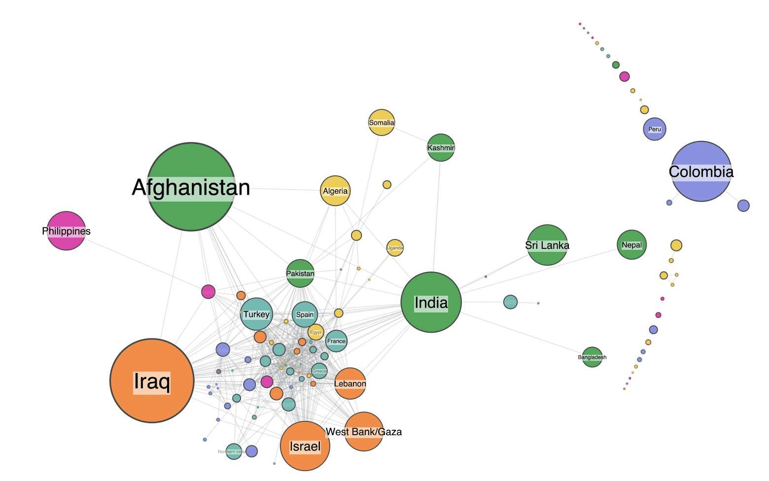
Next, I add the links. Remember, two countries are connected if they have a terror group in common.
This is just one of many ways to represent the dataset as a graph. Let’s start exploring it to see if we can identify where potential data quality issues might lie. We’ll focus on three:
- Misclassifications, perhaps caused by human error in data entry
- Incorrectly resolved entities, such as two different terror groups who share the same name
- Typographical variations, for example, different spellings of the same thing
Data quality issue #1: Misclassified data
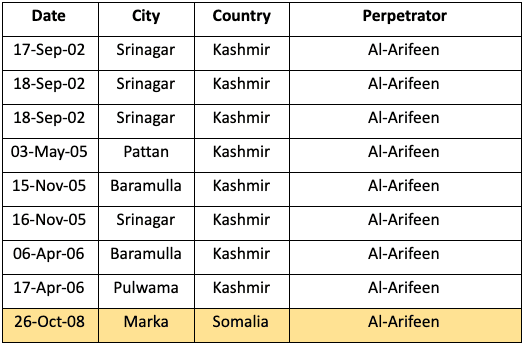
I spot my first mistake very quickly, thanks to the color-coded styling of nodes by world region. The heavy cluster of nodes at the center are tied together through some of the few international terror groups such as Al-Qaeda and Hezbollah. But my eye is drawn to two differently colored nodes – Somalia and Kashmir. Unusually, they’re linked to each other without being part of the main cluster.
This seemed suspicious. I went back to the source data to look at the attacks which contributed to this link.
The data shows that they’re connected by the Al-Arifeen terrorist group, an offshoot of the Lashkar-e Taiba terrorist organization operating in Kashmir. The data implies that the same group carried out an attack in Marka (Merca), Somalia. But when I read the attack description and the list of attacks by the same terrorists in Kashmir, there’s no evidence to link them with the incident in Somalia. This is most likely down to human error in the data.
Data quality issue #2: Incorrect entity resolution
Next I spot a similarly unusual pattern in the graph. There’s an isolated link between India and Russia.
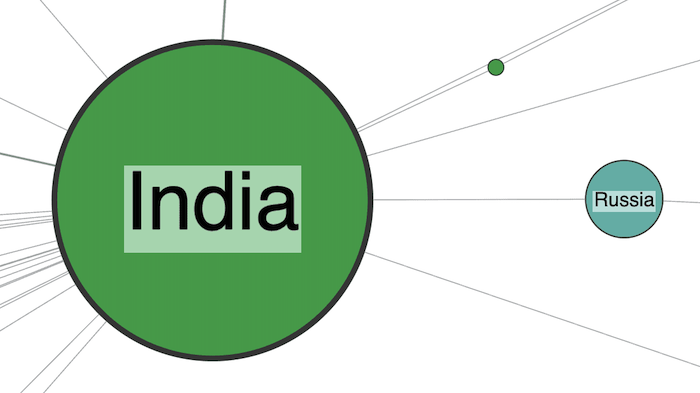
The link represents a group called “Black Widows”.
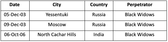
This data problem is more subtle. There’s nothing specifically wrong with any of these rows in the table. The problem is that Black Widows refers to two completely separate groups. One is a name given to Islamist Chechen female suicide bombers; the other is a breakaway faction of a group in the Assam region of India.
Again, the graph view has made this kind of incorrect entity resolution much easier to spot. Finding it by analyzing masses of tabular data would have been difficult and time-consuming. We can easily solve the problem by taking away the ambiguity and renaming the groups to Black Widows (Chechnya) and Black Widows (Assam).
Data quality issue #3: typographical variations in graph data
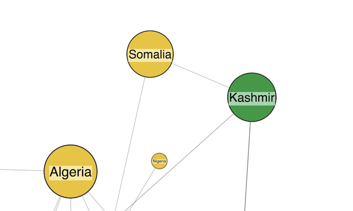
If you look closely at the previous graph visualization, you might wonder what the tiny green node that orbits India is. When I zoomed in to find out, I immediately found an example of another data quality issue.
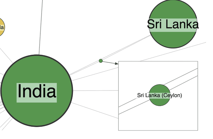
An easy mistake to fix – two different variations of the Sri Lanka identifier – and easily spotted in the graph view.
Now I’ve spotted data quality issues, what next?
Within 20 minutes of loading this data into one of our graph visualization toolkits, I’d found these three mistakes. It shows that graphs are a great way to sanity-check your data and spot errors. There’s no chance I’d have found these if I was scanning through the original spreadsheet.
Advanced features in our toolkit technology can also provide clever ways to fix dirty data problems fast. Using combos, our powerful grouping and combining technique, cleaning up the Sri Lanka issue above could be as simple as dragging and dropping problem nodes.
Start your graph visualization journey today
Graphs are useful, not just for finding errors, but also for fixing them. KeyLines and ReGraph come fully loaded with tools to help you build powerful interactions into your user interfaces. They could also help a compelling data cleansing tool to help clean and correct inaccuracies.
Questions? Ideas? Or just want to start your free trial of KeyLines or ReGraph today? Get in touch


