As 2018 draws to a close, we’re in a reflective mood.
It’s been another busy and successful year for Cambridge Intelligence. There’s been a multitude of new and improved KeyLines features, and three fantastic Connected Data Visualization Consortium (CDVC) events. We’ve enjoyed some high-profile recognition of our achievements, and welcomed two new partners to our Technology Alliance.
Sticking with our nostalgia theme, this blog post looks back at the top five most insightful articles we’ve published since the start of the year. If you read them the first time around (you did, right?), it’s a chance to recap on some highlights. If you’ve not seen them before, treat yourself to a reading session as you start winding down at the end of the year.
#5: Reduce clutter and increase insight with combos
We kicked off the year in style with the major release of KeyLines 4.0, featuring groundbreaking combos functionality.
Exclusive to KeyLines, combos let users minimize chart clutter while providing unprecedented insight into complex networks. It’s an easy way to simplify charts and get detail on demand by grouping nodes and links together.
You can quickly and easily build combos into your KeyLines application. It helps deliver fast and clear insight into connected data in cyber security, intelligence, and fraud detection, as well as IT networks, oil and gas, telecoms, and supply chains.
#4: Open source graph visualization
In this completely (un)biased post, our aim was to make life a little easier for product managers trying to choose which graph visualization technology is right for their customers, their developers and their business.
We weighed up the relative cost, compatibility, functionality and support benefits of using a commercial graph visualization software development kit (SDK) like KeyLines, compared with an open-source code library, or an off-the-shelf application. It should help you select the solution that’ll let your users find new and insightful ways to see and understand connected data.
#3: 5 steps to tackle big graph data visualization
This blog post was full of useful tips and techniques to help solve your big graph data challenges. It dealt with tricky problems around deciding which subset of data to present to users, and how to help them find the key patterns and connections.
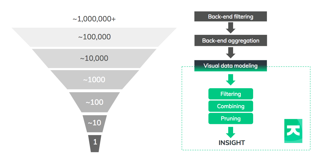
The post introduced the ‘data funnel’: a process that uses back-end data management and front-end interactions to reduce billions of data points into something a user can comprehend. It’s full of practical tips on aggregating, filtering, modeling and combining data to reveal the insight your users need.
#2: KeyLines 5.0: Magnificent map mode & more
Our top five had to include this blog post featuring our most recent major release, KeyLines 5.0. It describes how KeyLines helps you map a connected world with better performance and more clarity and insight than ever before.
This complete overhaul of KeyLines Geospatial – exposing new capabilities and improving the speed, smoothness and reliability of your geospatial views – is definitely worth highlighting. We made it possible to integrate KeyLines with a far wider choice of map tile and service providers (including Esri), and use your own images as maps instead of pointing to a map server.
#1: Can graph theory predict the World Cup winner?
And top spot goes to our blog post that correctly predicted France would win the 2018 FIFA World Cup.
What started as a fun experiment on applying network theory turned out to be remarkably accurate. By applying KeyLines’ Social Network Analysis centrality measures, we calculated which countries were most likely to advance to the later stages of the competition.
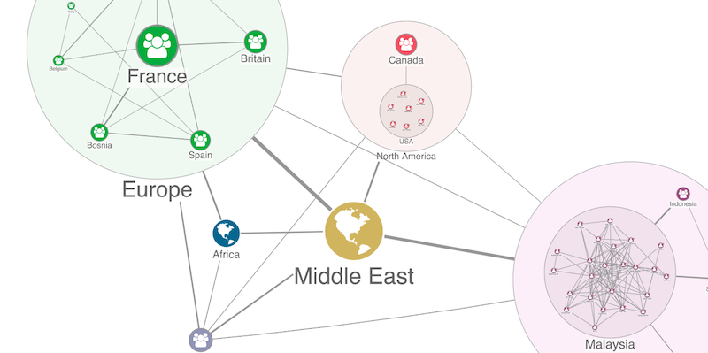
First we grouped players into combos according to their national team, then linked each player to their club side.
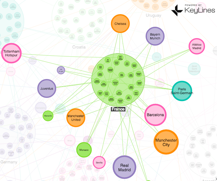
Then we used eigenvector – the centrality measure that scores nodes based on how well connected their connections are – to identify those footballers who play for clubs with a high proportion of quality players. France came out top, and sure enough, went on to lift the Jules Rimet trophy on July 15th.
The real winner for us was KeyLines. Quickly and easily, we ran sophisticated graph analysis to reveal deeper insight, bringing a fairly basic and incomplete connected dataset to life.
Ready to end the year on a high?
We hope you’ve enjoyed looking back at our best bits from 2018.
We remain firmly focussed on building the world’s best visualization software. There are many new and exciting plans for KeyLines in 2019, so it’ll be easier than ever for users to reveal threats and insight in their connected data.
Keen to end the year on a high? Request a free trial or contact us to find out what KeyLines can do for you.


