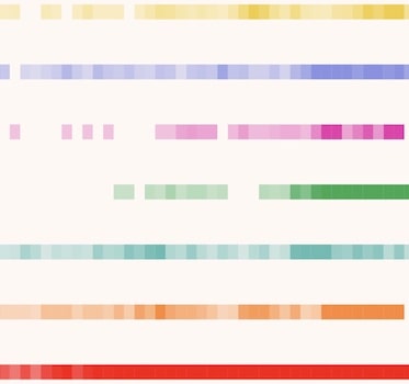
Color theory for data visualization
24th November, 2020
10 min read
We explore basic color theory, and how carefully-chosen colors can help make your visualizations look good, and...
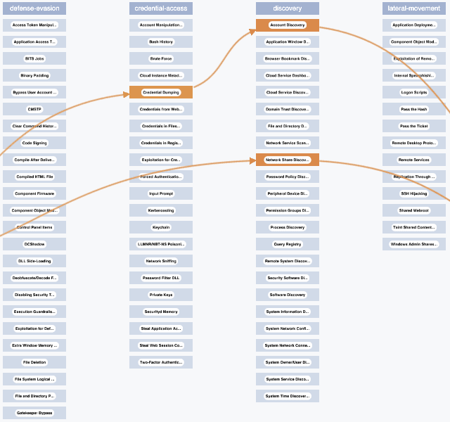
Six essential cyber security analysis tools
11th August, 2020
8 min read
With examples from the cyber security world, this blog focuses on six clever customization options in KeyLines and...
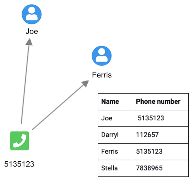
Graph visualization: the basics
21st April, 2020
15 min read
A non-technical, high-level introduction to graphs, graph models, graph databases and graph...
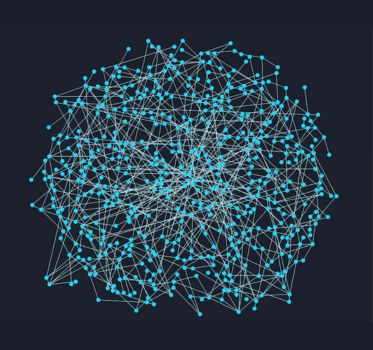
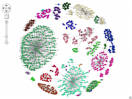
Graph visualization: fixing data hairballs
25th November, 2019
6 min read
Learn how to tackle the hairballs in your graph visualizations, where nodes and links are so densely connected you...
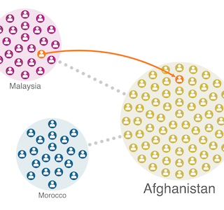
Get more from your graphs with glyphs
8th April, 2019
4 min read
This blog shows five of our favorite uses for glyphs to help breathe new life into your network visualization...
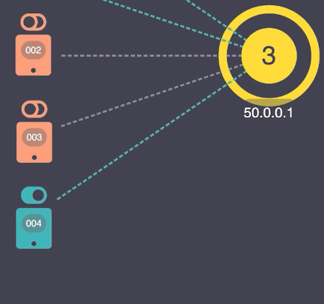
5 quirky ways to style combos for maximum impact
18th February, 2019
5 min read
Combos are great for reducing clutter and organizing your networks into something more manageable. This blog...
Network Clustering
11th January, 2016
3 min read
Our clustering function can identify communities in your networks. It has been carefully optimized to balance...
