Log data visualization for enterprise observability
Jan Girman Product Manager
6th March, 2025 | 7 min read
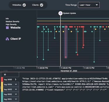
In this blog post, I’ll show how effective log data visualization improves your enterprise observability...
Jan Girman Product Manager
6th March, 2025 | 7 min read
In this blog post, I’ll show how effective log data visualization improves your enterprise observability...
Dan Williams Chief Product Officer
6th August, 2024 | 8 min read
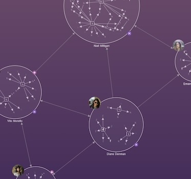
We look at six key areas of rapid change, and how successful organizations use link analysis techniques to keep...
Kevin Naughten Senior Product Manager
19th December, 2023 | 7 min read
Data overload is a real problem for busy analysts. How do they spot the red flags in a cyber security network? Or...
Dan Williams Chief Product Officer
26th July, 2023 | 6 min read
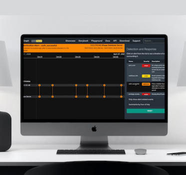
Timeline visualization gives cybersecurity analysts a scalable and intuitive way to investigate threat data, and...
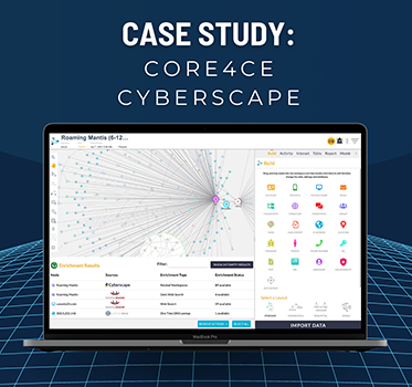
Andrew Disney Marketing Director
21st June, 2023 | 6 min read
See how Core4ce use KeyLines-powered visualizations to help keep critical systems safe from cyber...
Dan Williams Chief Product Officer
25th May, 2023 | 3 min read
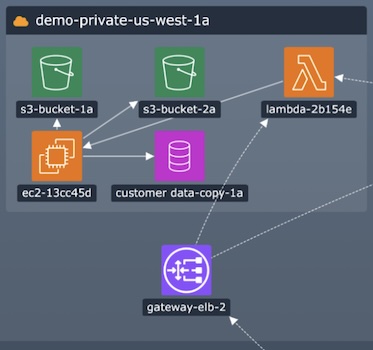
As companies move their digital infrastructure to the cloud, and as Infrastructure as a Service (IaaS) becomes the...

Alejandro Lemus Account Executive
9th May, 2023 | 10 min read
How do senior management teams prioritize cyber threat detection? We look at key trends from the latest reports,...
Matt Latham Product Manager
4th May, 2022 | 8 min read
Remember the WannaCry ransomware attack? Launched in May 2017, it was one of the most devastating and extensive...
Thomas Chan Software Developer
25th January, 2022 | 12 min read
Our updated guide to building a custom root cause analysis timeline and graph visualization app in React, with...
Registered in England and Wales with Company Number 07625370 | VAT Number 113 1740 61
6-8 Hills Road, Cambridge, CB2 1JP. All material © Cambridge Intelligence .
Privacy Policy | Security Framework
