
Summary:
This article uses six familiar children’s puzzles to illustrate practical graph visualization techniques. Each example highlights a principle: avoid unnecessary link-drawing, don’t make users work for insights, reduce visual clutter, label meaningfully, show how data changes over time, and choose colors that clarify rather than confuse. Effective graph visualizations reveal structure and meaning without overwhelming users – keeping detail available on demand, not all at once.
Graph visualization is a serious business. Our customers use visualizations built with our toolkits to catch criminals, fight fraud, and secure critical systems. But there’s no denying that graphs can also be fun. In this blog post, we’ll look at the graph visualization techniques we can learn from six different children’s puzzles.
At Cambridge Intelligence, we sometimes challenge each other with graph quizzes, where we create visualizations based on unusual data sets, and see if our colleagues can guess the graph based on the structure:
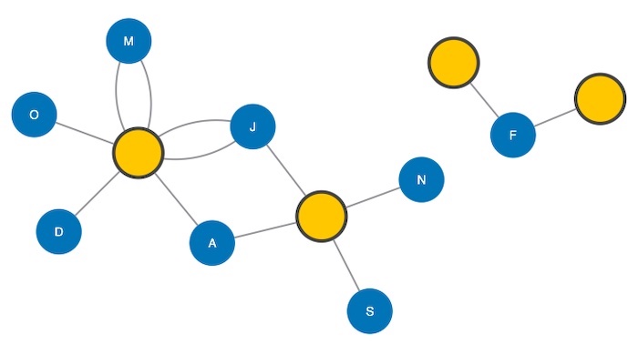
When I was a kid, my parents kept me busy on long car rides with a puzzle book full of mazes, word searches and so on. Today, although my own kids have tablets and other electronic devices, they still love puzzle books. And when I watch my daughter work on a connect-the-dots game, it reminds me that connecting the dots is basically creating a graph. The dots are nodes, and the connections are links.
Let’s take a look at connect-the-dots and a few other childrens’ games, and see if they have anything to teach us about graph visualization techniques.
1. Connect the dots
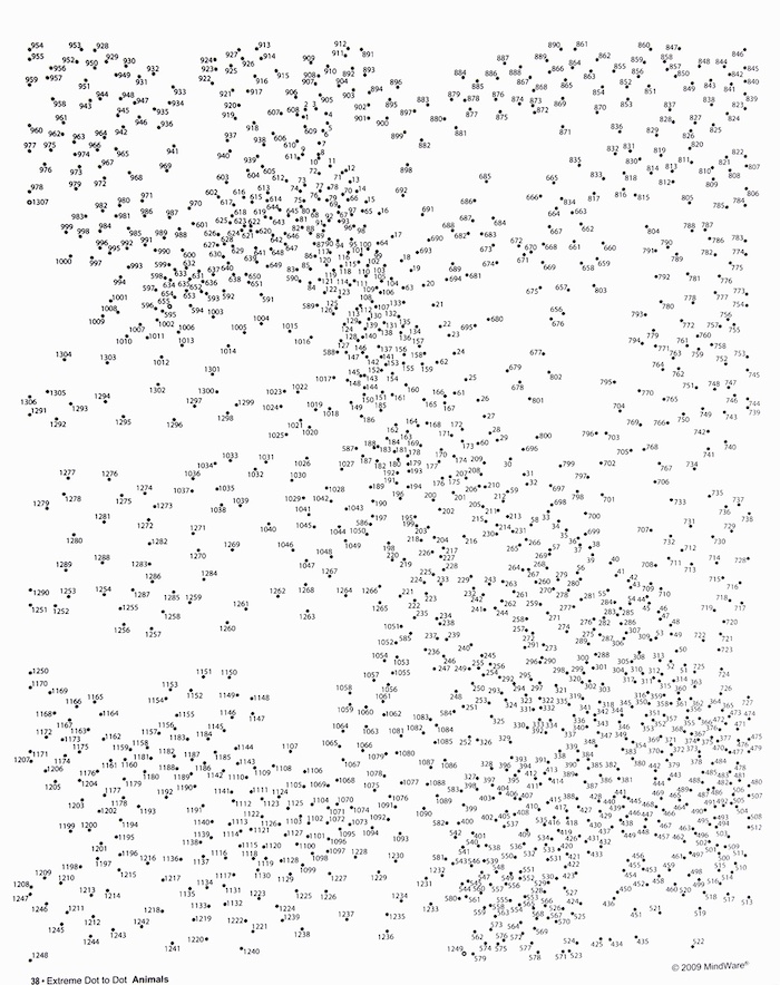
While researching this blog post, I came across a community of ‘extreme connect-the-dot’ enthusiasts: a group (mostly adults) who enjoy doing connect-the-dot puzzles with thousands of dots:
When many developers build a graph visualization, they imagine their users will want to draw links between two nodes. This might be to add information not included in the data or to speculate about the existence of a relationship.
They’d essentially be connecting the dots. It’s intuitive and compelling, but it’s not always the right approach. User-created links raise a lot of tricky problems, like writing back to databases, managing permissions and dealing with simultaneous actions. What if two people draw the same link at the same time? And what if they make a mistake? How will you reverse it?
Even so, when the use case calls for it, drawing links can be a very powerful way to tap into your users’ intelligence, not just relying on what’s in the data – for instance, when they’re using data visualization to work on a collaborative investigation.
2. The maze
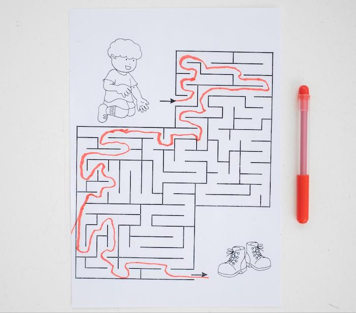
Graph visualization isn’t the answer to every question. It’s a great way to understand data structures and patterns, but if you just need an answer to a question, working with a visualization can be like asking for directions and getting a roadmap.
In this example, we use KeyLines’ social network analysis measures to show the shortest path between two nodes. The data we used came from the back page of my 2008 USA Road Atlas (the last year I had a printed map).
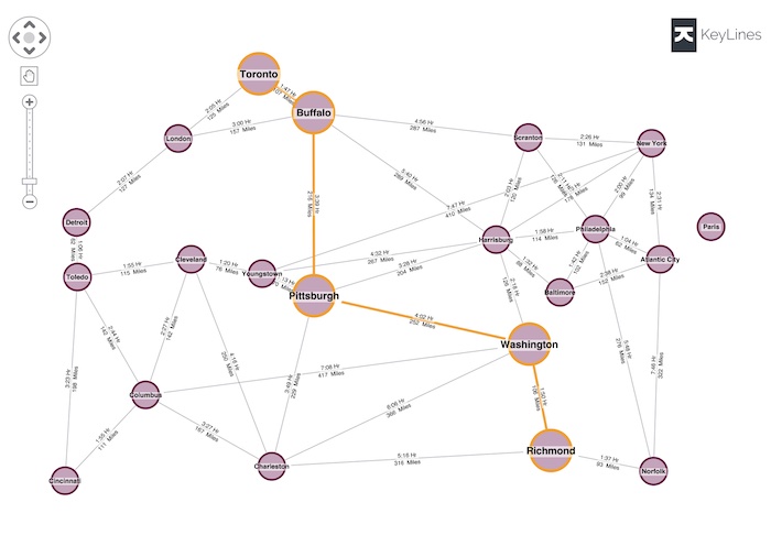
Finding the shortest path between two nodes is a valuable graph algorithm and a useful feature of our toolkit, and demonstrating it by showing the drive time between US cities is intuitive. But this isn’t how people plan road trips any more. Drivers rely on the algorithms their GPS device uses to plan the best route and provide turn-by-turn directions.
Don’t make your users do the hard work if they don’t need to.
3. Where’s Waldo?
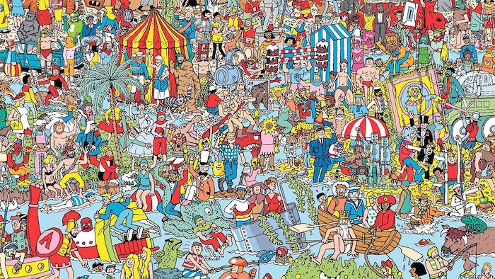
Part of the attraction of ‘Where’s Waldo’ (‘Where’s Wally’ for UK readers) is the visual clutter, and that ‘aha’ moment when you finally find the elusive character amid a visually distracting background full of vivid color.
This can be fun when you’re a kid, but visual clutter is poisonous to graph visualizations. That’s why our SDKs include powerful tools for reducing clutter – for more information see my webinar on managing clutter in big data visualizations.
We keep talking about decluttering because it’s important. As a product developer, it’s way too easy to populate a visualization with as much data as possible, and add as many visual features as anybody could possibly need. But this is almost always counterproductive.
You want to do the opposite of ‘Where’s Waldo’. Make it as easy as possible for your users to identify the nodes and relationships that are most interesting to them. You can do this by taking advantage of features in our products such as combinations, filtering, and reducing the graph density.
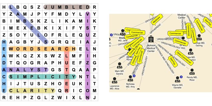
4. Word search
With word searches, instead of looking for Waldo, you’re searching for a specific sequence of letters among a jumble of others. And that jumble illustrates the pitfalls of labelling a graph. While it’s important for users to understand what they’re looking at, the wrong kind of labeling can be worse than no labeling at all.
Every node needs a unique identifier, but it’s not always a good idea to use the node ID as its label. If it’s something like a GUID, a registration number or a social security number, it won’t mean anything to most users. The label on a node doesn’t have to be unique – it could be the name of a company or a person – so long as it’s meaningful to the user.
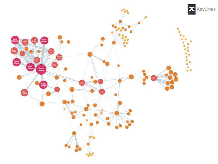
One technique is to use larger nodes with multiple labels. The node below has four labels, including the font icon, and a pink glyph. It can get across a lot of information without cluttering your chart:

Many developers (and many tools) label links by default, often with the relationship type. I’m not a fan of this approach. In the example below, most links fall into one of a small number of categories, so you get a lot of repetition which adds to the visual clutter:
One of my favorite graph visualization techniques is to color code links, and include a legend alongside the chart, like this:
5. Find the differences

It’s easy to find the differences between the farmyard scenes above – but not so easy to compare the two charts below. I added five nodes, removed five others, and reran a layout between the two, and there’s no practical way to find out what’s changed.

This highlights a problem with node-link visualizations – they are traditionally static snapshots of a dataset, and aren’t good at showing changes in data over time. There are two graph visualization techniques you can use to help users with this problem: filtering the graph, or using a timeline. I’ll show you both.
In this example, we’re showing the relationship between board members and organizations:
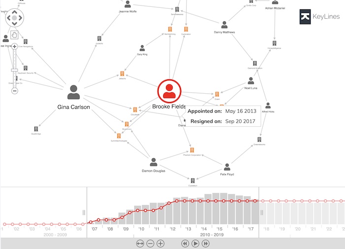
Each board member serves for a set period of time, so it’s important to show when they were active. On this graph, we’ve used an annotation. Hovering over the link shows us the exact start and end dates of Brooke’s tenure: we don’t have to hunt for the differences between a 2017 snapshot of the graph and a 2018 one. And look at the timebar at the bottom – the user can scroll and pan to choose an exact window of time, and filter the chart to show only relationships that were active during that period.
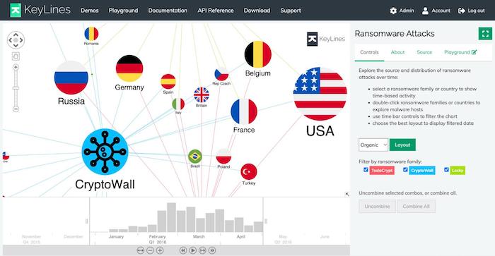
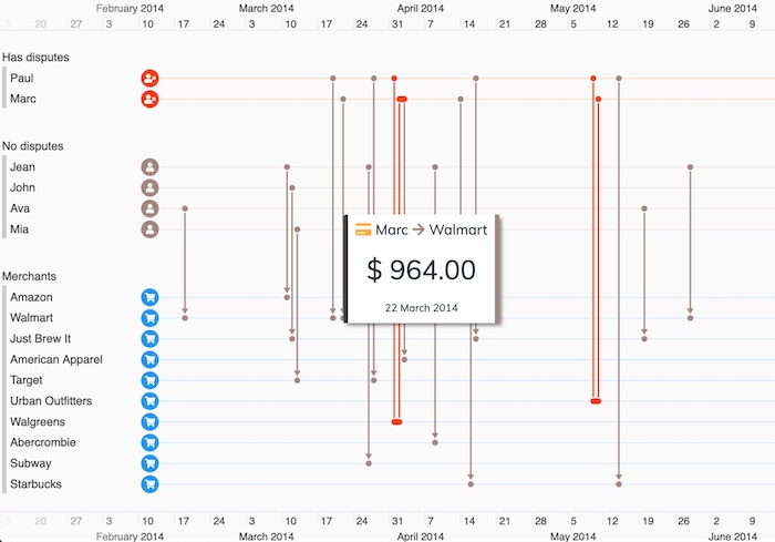
Another thing we can do with time-based analytics is to show exactly when relationships occurred. The example below uses KronoGraph, our timeline visualization toolkit, to identify money transfers in and out of various bank accounts:
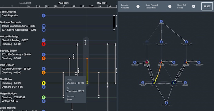
Viewed on its own, the traditional node-link visualization on the right doesn’t help us see the sequence of the transfers. Using filters would throw the user into a game of ‘find the differences’. The added timeline on the left makes it easy to see when specific transactions happened.
6. Color-by-number
A color-by-number game assigns a discrete color to each numbered area of the picture, so the artist doesn’t have to pick their own. Choosing colors for the different elements of a chart is an important task, and it often falls to a developer who’s more interested in getting the application working than making it look good. I’ve fallen for this myself in the past, using the Google color picker to assign random colors to node and link types. But it really is worthy of more effort.
Sometimes it makes sense to use a color scale that connects the saturation of the color to the property of a node. In the example below, we’ve color coded our nodes by their centrality score. The redder nodes are those that are more central, or well-connected, to the network:
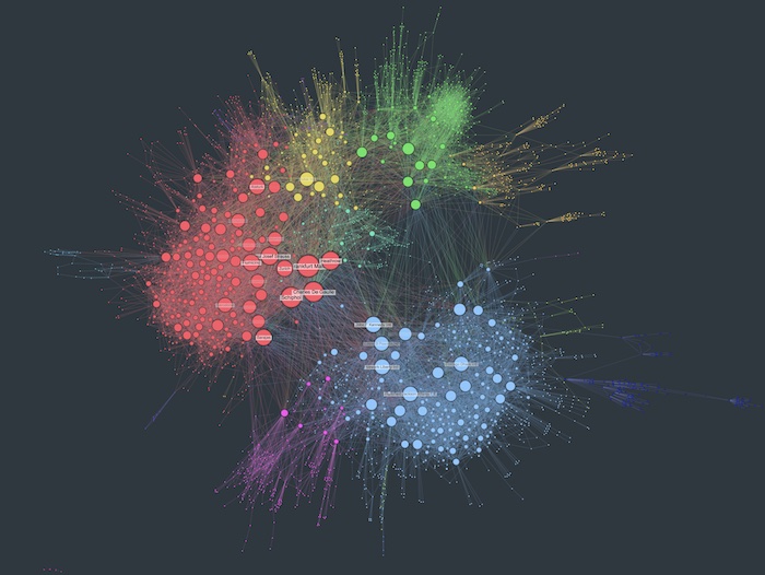
For larger charts, I like using specific colors to show node attributes, or to highlight node clusters. In this visualization of the global aviation network, European airports are colored red while North American airports are blue. It’s easy to tell them apart, even though we’re too zoomed out to see the labels on the individual nodes:
Link coloring is a different matter. Color coding links makes it easy to pick out clusters of the same color, and you don’t clutter your chart with repeated text. Stick to around five colors if you can, or it can be tricky to tell similar shades apart.
The example below uses two colors on the links in a timeline. Red indicates disputed transactions, and gray shows undisputed ones. The clusters of red links stand out, although you could consider a palette suitable for people with color vision deficiency (CVD).
For top tips, see our blog post on choosing color for your data visualization.
What we’ve learned about graph visualization techniques
The kids’ games that inspired this journey have proven to be useful more as anti-patterns, or examples of graph visualization techniques to avoid. But it’s been a useful exercise. Here’s what we’ve learned:
- Use visualization to see the structure of data, not to give specific answers
- Only show the must-see detail, revealing more on demand
- Use node labels sparingly, and link labels almost never
- Don’t make it possible for users to draw links unless you really know what you’re doing
- Use KronoGraph and/or the timebar to show how your data is changing over time
- Use node color to show type or property values, but color links only by type
If you’re eager to experiment with a visualization tool, getting started is child’s play. Just reach out to us for a free trial today.
Share:
