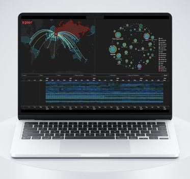
How sanctions reshaped – but didn’t reduce – Russian oil trade
Jan Girman Product Manager
24th February, 2026 | 13 min read
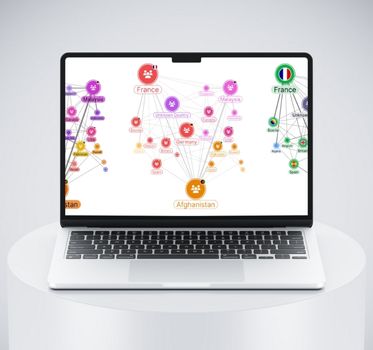
We worked with Kpler, the leading data provider in global trade intelligence, using our visualization SDKs to turn...
Jan Girman Product Manager
24th February, 2026 | 13 min read
We worked with Kpler, the leading data provider in global trade intelligence, using our visualization SDKs to turn...
Rosy Hunt Content Marketing Specialist
10th February, 2026 | 2 min read
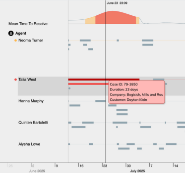
How do you keep your graph application responsive while helping users understand what they’re seeing? Our...
Rosy Hunt Content Marketing Specialist
27th October, 2025 | 3 min read
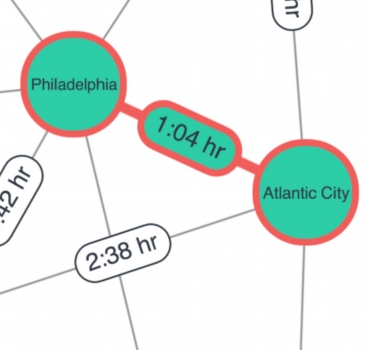
Whether you’re visualizing network graphs, timelines, or geospatial data, our latest SDK updates give you...
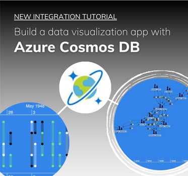
Ryan Shimmon Commercial Software Developer
14th September, 2025 | 19 min read
This Azure Cosmos DB tutorial shows you how to build a graph database visualization application using...
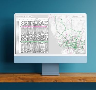
Jan Girman Product Manager
5th August, 2025 | 10 min read
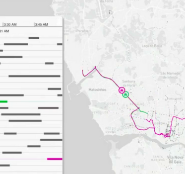
Pattern-of-life analysis reveals habits and behaviors in complex data. See how timeline and geospatial...
Rosy Hunt Content Marketing Specialist
10th July, 2025 | 4 min read
The newest versions of our data visualization tools bring features that make them faster, better-looking, and...
Zach Mason Product Designer
24th June, 2025 | 18 min read
We share expert graph visualization UX principles that make the difference between user frustration and...
Courtney Collins Product Manager
13th May, 2025 | 3 min read
From sleeker animations to richer styling and smoother interactions, these updates help you create visualizations...
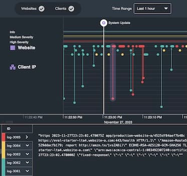
Jan Girman Product Manager
6th March, 2025 | 7 min read
In this blog post, I’ll show how effective log data visualization improves your enterprise observability...
Registered in England and Wales with Company Number 07625370 | VAT Number 113 1740 61
6-8 Hills Road, Cambridge, CB2 1JP. All material © Cambridge Intelligence .
Privacy Policy | Security Framework
