Pattern-of-life analysis for intelligence
Jan Girman Product Manager
5th August, 2025 | 10 min read
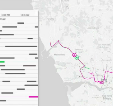
Pattern-of-life analysis reveals habits and behaviors in complex data. See how timeline and geospatial...
Jan Girman Product Manager
5th August, 2025 | 10 min read
Pattern-of-life analysis reveals habits and behaviors in complex data. See how timeline and geospatial...
Bonney O'Hanlon Product Manager
31st January, 2023 | 7 min read
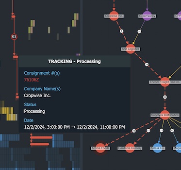
Over recent years we’ve seen more and more businesses digitizing their supply chain processes. Our latest demo...
Catherine Kearns Content Strategist & Team Lead
11th October, 2022 | 7 min read
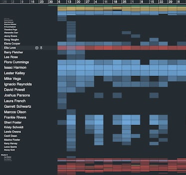
This post shows how unique navigation features in KronoGraph, our time-based visual analytics SDK, help analysts...
Christian Miles VP of Sales
6th July, 2021 | 8 min read
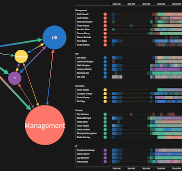
Let’s make our visual network analysis tool for dashboards even better! In pt2 of this series, we use...
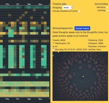
Matt Michel Developer
6th April, 2021 | 8 min read
Let’s use KronoGraph and ReGraph to dig deeper into a Twitter data visualization to find patterns of...
Registered in England and Wales with Company Number 07625370 | VAT Number 113 1740 61
6-8 Hills Road, Cambridge, CB2 1JP. All material © Cambridge Intelligence .
Privacy Policy | Security Framework
