Page contents
- 1. What is network visualization?
- 2. Why visualize networks?
- 3. Who visualizes networks?
- 4. How to build a network visualization
- 5. Best practice resources
- 6. Common visualization challenges
Related topics
What is network visualization?
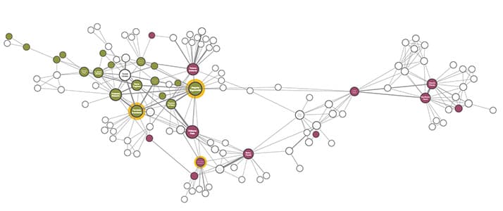
Network visualization, also known as graph visualization or link analysis, is the process of visually presenting networks of connected entities as links and nodes.
Nodes represent data points, and links represent the connections between them.
To look beyond your flat data model and understand connections in your data, you need powerful network visualization tools.
At Cambridge Intelligence, we help developers build interactive tools for visualizing networks that are 100% customized to their users, their data and the questions they need to answer.
FREE: The ultimate guide to graph visualization
Explore proven strategies for building successful graph visualization applications.
Why visualize networks?
The world is densely connected. If there’s an interesting relationship in your data, you’ll find value in visualizing networks.

It’s intuitive
Exploring networks as node-link structures instantly makes sense, even to people who’ve never worked with connected data before.

It’s fast
Our brains are great at spotting patterns, but only when the info is in a tangible format. Visualizing data as a network helps you identify trends and outliers quickly.

It’s flexible
Interactive network visualization simplifies complexity, revealing context and connections on demand. It’s ideal for getting a quick overview or focusing on specific connections.

It’s insightful
Through interactive data analysis, you gain deeper knowledge and understand context. That’s hard to achieve with a static, aggregated visualization.
New to network visualization?
If you’re new to visualizing networks, we’ve got a library of resources, blog posts and tutorials to help. A good place to begin is our DataViz 101 blog category
Who uses network visualization?
Connected data is all around us. We help organizations solve their biggest challenges.
Cyber threat analysts…
…need interactive visualization to reveal network vulnerabilities, detect malware and discover trends.
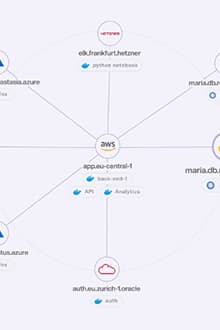
IT infrastructure managers…
…rely on network mapping software to discover bottlenecks and manage vulnerabilities.
Security analysts…
…use data visualization to interpret and communicate threat information from multiple sources of intelligence.
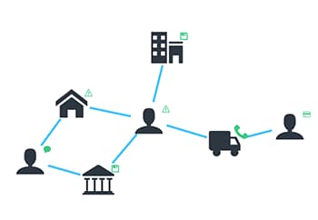
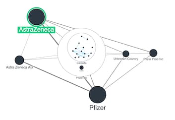
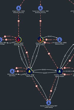
Fraud analysts…
…work with data visualization tools to identify, investigate and predict financial crime.
Pharma scientists…
…are under pressure to uncover fast insights in noisy pharmaceutical data. Network visualization is the perfect solution.
Supply chain managers…
…identify inefficiencies, manage regulatory compliance and find new ways to innovate using connected data visualization.
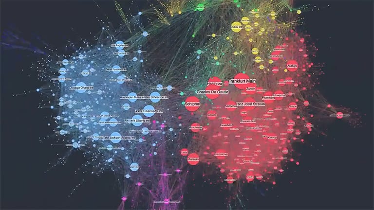
Exploring real-world network visualization
In this webinar, data visualization expert Corey Lanum looks at use cases that show:
- how network diagrams can help you tell a story and even predict the future
- why the ‘when’ is as important as the ‘who’ and ‘what’
- how visual appeal isn’t just about esthetics
He does this with examples from the worlds of intelligence, cyber security and financial crime.
What types of networks can be visualized?
We think there are no networks that CAN’T be visualized. If your data contains complex connections, you’ll find value in visualizing it. We’ve even started mapping the internet.
Here are a few more common examples we’ve worked on with our customers:
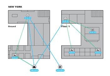
Infrastructure
From the internet to gas pipelines, corporate IT systems to global telecoms networks: network and timeline visualization are the best tools for making sense of complex infrastructure data.
Network mapping software for infrastructure
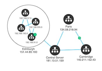
IT networks
Understanding big, complex telecoms networks is challenging. With the help of network visualization, it doesn’t need to be.
Network alert and network topology visualization
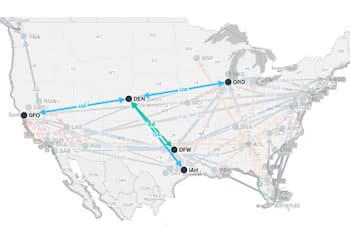
Supply chain
More and more businesses are digitizing their supply chain processes. Our latest demo shows how KronoGraph, our time-based visual analytics toolkit, can support a reliable management tool with supply chain data visualization at its heart.
Supply chain: the spinach story
Visualizing the internet
The internet can be a chaotic and unpredictable network.
For most of us, flaky connections and dropped data are a mild inconvenience. For enterprises, they can be a disaster.See how the Syntropy project is building a better way, with connected data visualization at its core.
How to build an interactive network visualization
So, you’ve chosen the tools and tech stack that work for you. It’s time to start designing the perfect network visualization. Find out how to build a network analysis dashboard that gives a great user experience – and take it to the next level with powerful timeline visualization.
Recommended viewing: The right tools for the job
In this short video, you’ll learn about the benefits of using KeyLines and ReGraph, our JavaScript software development kits, for your connected data visualization project.

Network visualization best practices
Building a great user experience

Visual network analysis dashboards that work
Open any data management app and the first thing you’ll see is a complex data dashboard of bar graphs, pie charts and metrics. But if your users need to track, measure and analyze connected data, what they really need is visual network analysis.

Get the perfect look & feel for your data visualizations
Building a data visualization into your products is about more than just putting information on a screen. Your visualization is probably part of a larger, carefully-designed, product UI.
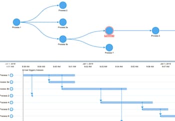
Visualizing networks that evolve over time

Dynamic network visualization methods explained
Most connected data has a time-stamped element. Sometimes, that time element holds the insight that unlocks everything else. A time bar gives users the ability to filter and summarize time-based connected data without overwhelming them.
KronoGraph: the timeline visualization toolkit
Take your connected data visualization to the next level with KronoGraph, the first toolkit for scalable timeline visualizations that reveal patterns in time data.
Visualizing data at scale

Layouts for visualizing large networks
There’s no more famous network than the internet itself. But highly connected networks present data visualization challenges. In this blog, we’ll map out the shape of a small portion of the internet with a network chart.

Network alert and network topology visualization
Understanding big, complex network topologies, like IT infrastructure or telecoms networks is challenging. With the help of network visualization, it doesn’t need to be.
Network visualization tools and tutorials
When it comes to building your own web application visualizing connected data, you have options.
There are standalone tools, or community-built open source code libraries, or you can create something in-house from scratch. If you want the best of all worlds, our commercial SDKs are market leaders. They deliver the customizability and flexibility of in-house components, with the reliability, robustness, performance and advanced functionality of a technology backed by a dedicated team of experts.
KeyLines
For JavaScript developers
Enjoy the flexibility to code how you like. Add connected data visualization to your applications that work anywhere, as part of any stack.
ReGraph
For React developers
With ReGraph’s simple data-driven API, it’s quick and easy to add connected data visualizations to your React applications.
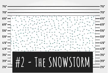
Some common network visualization challenges
Hairballs, snowstorms and starbursts can be a problem for many network visualization projects, cluttering up charts and concealing crucial insights from investigators and analysts. But we have solutions – click on the images below to learn more.