Many will be glad to see the back of 2020.
Although it was far from a usual year for all of us, we’ve tried to keep things business as usual on our blog, continuing to deliver the content our audience expects and enjoys. As a result, we’ve added over 50 high-quality posts to our data visualization blog since last year.
As the year finally comes to a close, we’ll reflect on a shortlist of content our audience found most useful and we’ve been most proud of. If you didn’t read them the first time around, we hope you enjoy them now.
#7 Customization options bring data to life
We’ll start with a post full of tips to make your graph visualization product stand out from the crowd: six tools to keep cyber security analysts ahead of the curve.
We chose to focus on cyber security here, but the tools and techniques covered are useful and effective for any data visualization use case that’s trying to understand connected data. Slick new curved links add clarity and character, while sequential layouts are the perfect choice for presenting hierarchical data. There are lots of suggestions for creating striking visual effects that also help users understand their data better.
#6 Hume & the European Space Agency
Our case study on How Hume & KeyLines make levels of insight skyrocket made it to #6.
With help from our friends at GraphAware, we learned how the European Space Agency (ESA) were understanding natural language processing capabilities and the power of graph visualization.
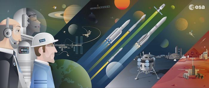
One of ESA’s challenges is to keep track of the dynamic world of satellite technology. They used GraphAware’s graph-powered insights engine, Hume, to create a knowledge graph that’s visualized using KeyLines. With an interactive visualization to work with, they could dig deep into their data to reveal insight into important ecosystems. And as new data is added, machine learning models are applied and the knowledge graph updates itself, so KeyLines always visualizes the latest information.
#5 ReGraph’s intuitive layout adjustments
With the release of ReGraph 2.0, we announced that adaptive graph layouts to make your app amazing had arrived in our graph visualization toolkits.
Analysts wanted a way to track changes in their data more easily. They didn’t want to run a full layout every time there’s a change to the chart and risk losing their mental map of where items exist.
We responded with new adaptive layouts. Every time something is added, expanded or removed from the visualization, components move just as much as they need to and no more. Users can trust ReGraph’s dynamic adjustments to get the layout just right.
Learn more about ReGraph
#4 Visualizing blockchain and cryptocurrency
AML compliance in the age of cryptocurrency takes its well-deserved place at #4.
The cost of cryptocurrency fraud, scams and theft last year totalled approximately $4.5bn. In this first of two blog posts, we explored cryptocurrency’s reputation problem in detail, demonstrating how link analysis helps organizations manage and report regulatory compliance.
The blog post uses examples from XRP, the world’s 4th largest cryptocurrency, created by technology firm Ripple. It’s also worth checking out part two, which covers identifying high-risk transactions in XRP/Ripple data. It looks at each stage of the process for visualizing and analyzing cryptocurrency: from building a graph model and designing a visual model, to exploring the data and revealing patterns of possible AML violations.
#3 Visualizing an energy grid with Memgraph
Our focus on visualizing network infrastructure with Memgraph & ReGraph proved extremely popular.
This blog post integrated ReGraph with Memgraph’s graph database, then visualized the fascinating system of energy pipelines routing electrical power across Europe.
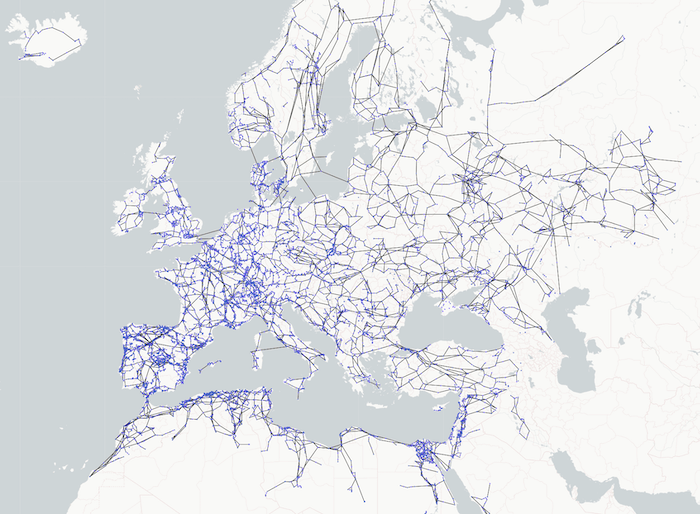
The topology of infrastructure networks is an ideal use case for visualization. It reveals structures, dependencies and vulnerabilities that help make infrastructure managers make their systems more resilient and effective.
#2 Building the best user experience with KeyLines
We celebrated the release of KeyLines 6.0 with an article on exploring the exciting new events engine.
KeyLines’ event model has always been one of the toolkit’s most powerful and underrated features. As the mechanism developers use to define what happens when users interact with their visualizations, it defines the entire user experience.
With KeyLines 6.0, we completely overhauled the events engine to give developers absolute control over every user interaction, together with more consistent behavior across devices and enhanced support for touch screens, track pads and keystrokes.
There’ve been new feature-rich versions since KeyLines 6.0 and ReGraph 2.0 were released. For details, check out the most recent KeyLines and ReGraph product updates.
Find out more about KeyLines
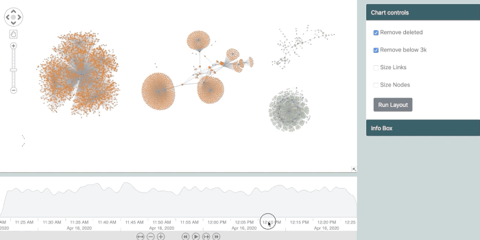
#1 KronoGraph use cases
And at #1, we’ve got 5 popular use cases for KronoGraph timeline analysis.
We were excited to add KronoGraph, our timeline visualization toolkit, to our product line-up this year. It’s a powerful toolkit for building apps that uncover the hidden story in time-based data.
Over 100 JavaScript and React developers in some of the world’s leading security and anti-fraud organizations took part in our hugely successful KronoGraph early access program before we released version 1.0.
There’s already a range of useful content to help you get started with KronoGraph – from the basics of timeline data visualization to Bond-themed getting started tutorial for JavaScript and a getting started tutorial for React developers. But our stand-out piece focused on use cases and how to discover what timeline visualization can do for your industry.
Was your favorite in our top 7?
Did you discover anything in our 2020 shortlist that you’d missed the first time around? Are you surprised that we left out other popular blog posts? (It was a tough call not to include our graph visualization basics 3-parter.) Are you ready to sign up for a free trial and see what our toolkits can do for you?
We’ll be back in 2021 with even more practical and interesting content to help with your data visualization journey. Until then, have a happy and healthy end to the year.


