FREE: The ultimate guide to graph visualization
Explore proven strategies for building successful graph visualization applications.
Summary: This article introduces the basics of graph visualization: when your data contains relationships, modeling it as nodes and links makes patterns, clusters and outliers far easier to see and explore than in tables. Effective visualizations are interactive, avoid showing everything at once, and use styling, filtering, grouping and glyphs to highlight what matters. The goal is to design visual models that simplify complexity, reveal insight quickly, and match how users think about their data.
Are you new to graph visualization? Are you keen to understand the node-link graph model? Do you need answers to fundamental graph questions before you add graph visualization to your own applications?
Read on for a non-technical, high-level introduction to all things graph. We’ll cover:
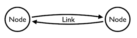
A graph is a data model that features connections (called links or edges) between entities (called nodes or vertices) and properties.
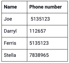
Here’s a simple table. Each row of data tells us that there are connections between two entities: a person and a phone number.
The human brain easily makes sense of small pieces of information like this. It’s good at spotting patterns too. We quickly recognize a connection between Joe and Ferris: they share the same number.
We can build a basic node-link graph model based on this data and then visualize it. The high-level process is simple: identify which entities you want to represent as nodes and links, and then apply them.
As long as you have connections in your data, even two simple columns are enough to get value out of looking at it in a node-link graph chart.
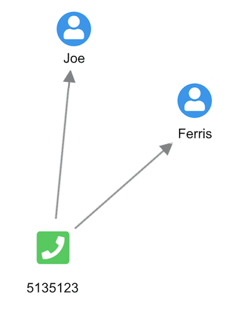
We’ve used nodes to represent people and phone numbers and links to connect the two. You can instantly spot the connection between Joe and Ferris.
We didn’t need to model this small data set as a node-link graph and then visualize it to spot our connection. But what happens when our table goes from four rows to 400,000? And what if we bring in additional columns of property information such as full names, addresses, social security numbers, places of work and so on? The more data we add, the greater the number of connections.
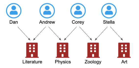
Here’s a slightly more complex example. The left-hand table is a list of students, each with a primary key. The right-hand table has a list of classes with primary keys. The central table – often called a link table – matches up the two.

At a glance, it’s hard to work out which students are attending what classes. We have to trace each primary key from one table to another.
Here’s where it makes more sense to model the data as a graph, and visualize it. A graph model, with nodes representing students and classes, and links representing attendance, turns our conceptual view into a logical view.
Applying a graph model to your data makes sense whenever you need to understand relationships. We’ve intentionally used simple examples here, but your data is likely to be more complex. There’s no ‘one size fits all’ approach, and your design will depend on your company style, the type of data you have, and what your users need. We’ll take a closer look at data modeling best practice later on.
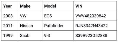
Creating a node-link graph model isn’t always the answer. Some datasets don’t feature connections, so there isn’t much value in applying the node-link structure to them.
This table features a simple list of cars and their VIN numbers. Since each car has a unique VIN number, representing it in graph format wouldn’t reveal any hidden connections.
If it included details of vehicle owners, insurance policies and dealerships where the cars were bought, a node-link graph representation could be very helpful. But as the table is restricted to unique data, there’s no need to model it in that way.
Once you translate the nodes, links and properties into the real-world representations in your visual model, you can use graph visualizations to bring them to life. What are the benefits of doing this? Here are just a few.
When we try to understand a difficult concept or make sense of a complex problem, we’ll often create a mental picture. We might even draw it out on a whiteboard or notepad. Either way, we’re trying to visualize the facts to gain a new perspective and build an understanding.
That’s exactly what’s happening with graph visualizations. They’re intuitive, and they make instant sense – even to people who’ve never worked with connected data before.
They help you understand what’s going on in the data, spotting patterns and outliers that are worth investigating further.
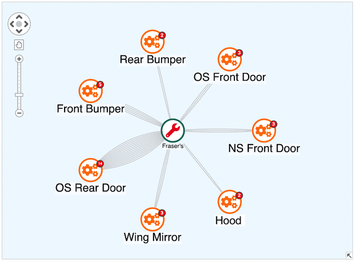
This graph visualization shows auto repairs carried out by Fraser’s. Using links to represent types of repair, it’s immediately obvious that offside rear door repairs are the most common type.
For more examples, see designing simple visual models that users love
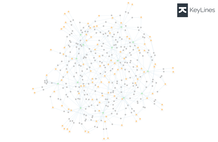
Node-link graph visualizations are scalable. Even in your largest datasets, it’s easy to find and explore connections that you would struggle to find in tables of rows and columns.
The trick is to filter out the noise, so that you can focus on nodes of a specific type, or events that took place at a certain time or place. Our toolkit technology puts you in control of your dataset, letting you hone in on the detail you need.
Learn more in Five steps to tackling big graph data visualizations
Users rely on our software to uncover threats hidden in their data connections. The new perspective they gain from visualizing it, together with advanced analysis features, reveals insights that drive investigations.
Our social network analysis measures reveal the relative importance of every node in a network. They quickly identify which nodes are the best connected, have the most influence, are the best broadcasters of information, and more.
You’ll find more useful information in Social network analysis 101: centrality measures explained
Explore proven strategies for building successful graph visualization applications.
Follow these seven steps for designing a graph visualization online app, and you’ll give your users the tools they need to succeed.
When you’re designing an online graph visualization app, interaction is key. Don’t just present analysts with a static node-link graph. Give them the interactive tools they need to interrogate the data, reveal threats and uncover insight. There has to be a two-way flow of information between the graph visualization app and the user.
In this example, as the analyst focuses on a small part of a large network, the app responds to every click, zoom and hover chart action by revealing more detail on demand. We call these actions events, and they’re controlled by a powerful events engine.
The need for this synergy between user and the chart affects how we’re designing our graph visualization app.
If you were talking to an analyst about how a complex investigation was going, you wouldn’t describe every single item of information in random order. You’d focus on the most important points before going into more detail about current lines of inquiry, answering their questions as you go.
You should take the same approach with an interactive node-link graph visualization. You don’t need to cram every piece of information into the chart at once. That’ll just overwhelm analysts, who won’t know where to begin their investigation. Use aggregation and combos to reduce graph density, and filtering to show sub-sections of the graph.
Learn more about strategies for visualizing graph data at scale
There are so many ways that styling visual properties can help you convey interesting things about your data. We’ll take a look at some of the most impactful ones, starting with links.
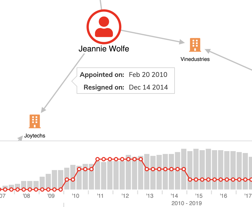
You can style links however you like. Solid, dashed, dotted, directional, curved or colored lines can each tell the user something special about that connection. You can even animate connections to show directional flow.
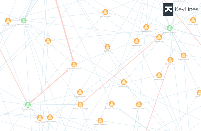
A popular way to indicate the volume of traffic or the strength of a connection is using link width. This graph visualization features cell phone traffic over time. The greater the number of calls between phones, the wider the link and the easier it is to spot unusual patterns.
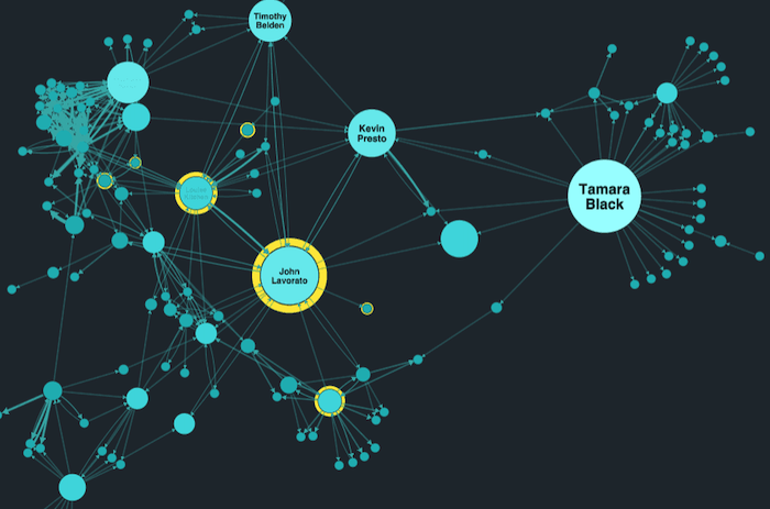
If you saw this node-link graph without any context, you’d assume there was something special about the larger nodes. And you’d be right.
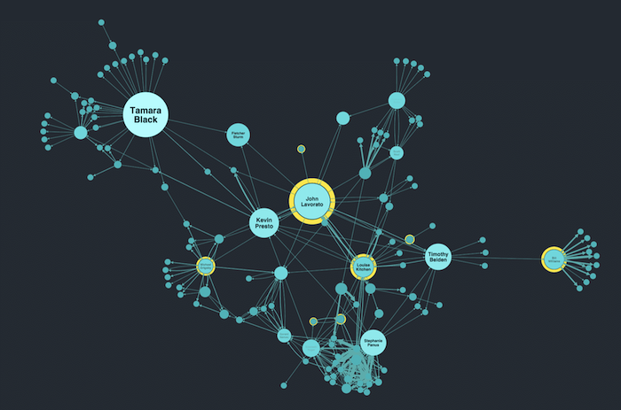
We’re looking at email data collected by US federal investigators in the wake of the Enron collapse. Our toolkits feature complex social network algorithms that reveal key information about a network, such as which nodes have the greatest influence over others.
You don’t have to understand how the algorithm works to recognize which nodes are worth investigating further. And because seniority in the organization is also relevant in this scenario, we’ve styled director-level employees with yellow halos.
Just as you should avoid plotting everything on the chart at once, you should also steer clear of cluttering the chart with too much text. Use other techniques instead, such as annotations or tooltips that reveal on hover, or information panels detailing search results, or using advanced node styling that reveals more information as you zoom in. That keeps the information handy if analysts need it.
We’ve seen that you can convey a lot of information with clever item styling and sensible labeling. There’s another node styling option that’s perfect for representing property details: glyphs.
Typically, these are small counters on a node’s border that give more information about an item. It means you don’t have to sacrifice any of the details your users need to help reveal insight.

The versatility of glyphs gives you an opportunity to get creative, too. From creating interactive glyphs to using them as labels, find out how to get more from your graphs with glyphs
With so many features and visual styling options, It’s easy to get carried away with your node-link graph design. If you try to do too much in one chart, you’ll risk giving your users sensory overload.
With your first draft, ask yourself what kind of experience you’re giving your users. Is it consistent? Accurate? Can they explore and filter easily? Have you done any user testing? What was the feedback?
For more practical help, check out how to avoid wrecking your graph visualization
Let’s return to your data model – the blueprint for building your database, and for ensuring data integrity, consistency and accuracy. Visualizing your data model makes it easier to explain to team members and stakeholders.
Data doesn’t need to be in a graph database in order to visualize it. We’ve created our graph models easily from tables, rows, columns, foreign keys and relationships.
Here are three simple steps you can follow to design a visual model that works for your users, their data, and the questions they need to answer.
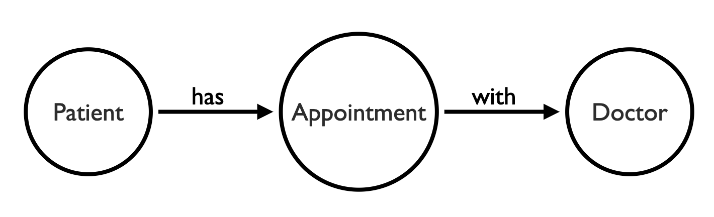
Let’s say we’re designing a healthcare data visualization. Our data model might include entities like doctors, patients, and appointments.
We could model this visually as:
Simple enough. But when we load our data into a graph visualization using this model, the chart looks very busy:
Instead of modeling our appointments as nodes, they could be links between patients and doctors – removing a third of the nodes from our chart. We can also size those links, based on the volume of appointments between a doctor and patient:
This model makes it easier for the user to answer simple questions, like ‘how many patients has a doctor seen?’ and ‘how many appointments has a patient made’?
We can use styling to add properties of our data into the visualization. For example, here we’re highlighting patient complaints by color coding links:
If visualizing these patient-doctor relationships was the sole purpose of your application, then we’re already done. But you should always look for ways to enrich or simplify your model, depending on your users’ needs.
For example, we could remove the patient nodes and add links directly between doctors, to show the number of shared patients. Or if we have information about doctors’ specialties, we could change the data model to show how patients are shared among fields.
For a more in-depth look at data modelling, read our ultimate guide to modeling graph data
Here’s a simple insurance claim.
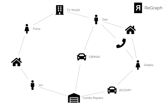
The chart reveals some useful information:
A fraud analyst is likely to be interested in these relationships and connections, so we should design our visual model to highlight those links.
By collapsing intermediate nodes and links, we’re left with a simpler visual data model that shows users the information they need to understand. We’ve used glyphs on the links to avoid losing any of the detail in our original visualization:
We can simplify this visual model further with combos. Let’s group individuals registered at the same address:
Now our node-link graph gives users a simple overview of the data, clearly showing two groups of people with potentially suspicious connections.
Careful use of visual styling allows you to show properties of your data, in a way that adds context without overwhelming the user.
Here’s a visualization of a group of individuals, that shows how they interact with one another on social media.
A basic rule of visualization is to show only as much information as you need to uncover insight. The accounts and posts are useful, but they don’t all need to be on the screen all the time. We’ve used combos to combine individuals, their accounts, posts and tweets into a single node, which can be expanded for detail on demand.
We’ve used some other styling techniques to help the user understand intuitively how to interact with the node-link graph, including:
With these simple design choices we’ve created a clear and insightful visual model that lets users uncover insight quickly and easily.
Visual data modeling can be tricky, but it’s worth taking the time to get it right. The best way to get started is to try out your ideas in one of our graph visualization toolkits. Just request a trial to get started.
Visualize your data! Request full access to our SDKs, demos and live-coding playgrounds.
Registered in England and Wales with Company Number 07625370 | VAT Number 113 1740 61
6-8 Hills Road, Cambridge, CB2 1JP. All material © Cambridge Intelligence .
Privacy Policy | Security Framework


