- 1. What is graph visualization?
- 2. Why visualize graphs?
- 3. The basics
- 4. Who visualizes graphs?
- 5. Developer guides
- 6. Best practices
Page contents
Related topics
What is graph visualization?
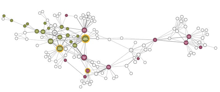
Graph visualization, also called link analysis or network visualization, is a way to visually represent, explore and analyze the connections between entities in data.
This approach helps you understand patterns, relationships and structures within the data that would be difficult or impossible to uncover through other forms of analysis.
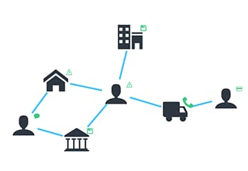
The most common and intuitive model for graph visualization is the node-link model, where nodes represent entities (such as individuals, devices, or accounts) and links represent the connections or relationships between them (such as transactions, interactions, or communications).
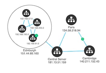
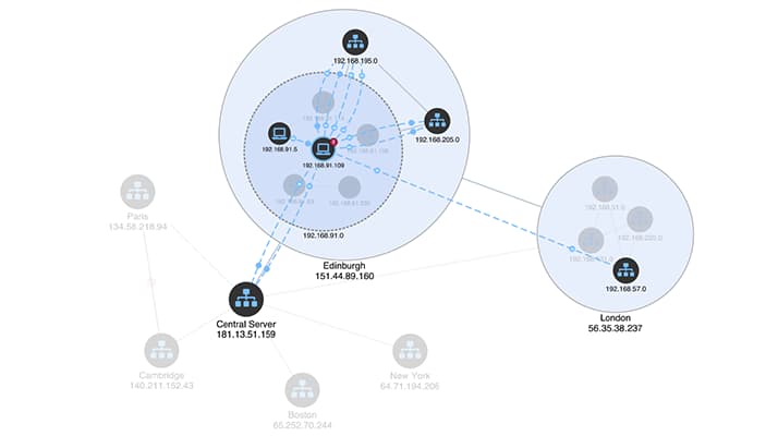
These nodes and links can represent anything – for example financial transactions between bank accounts, network traffic between devices on a network, or social interactions between friends.
It doesn’t matter how large or small your data is, or where it’s stored. As long as it contains relationships between different entities, graph visualization is a powerful tool for making sense of it.
Why visualize graph data?
The world is densely interconnected, and answering important questions often requires understanding those connections. Graph visualization helps you achieve this by making relationships within data visible and actionable.
There are four key reasons why graph visualization is such a powerful tool:
- Intuitive – The node-link graph model is instantly understandable, even to people who’ve never worked with graphs before. It gives an immediate and clear view of relationships.
- Fast – Humans are great at spotting patterns when data is presented visually. Visualizing graphs accelerates the process of identifying trends, outliers, and clusters.
- Scalable – graph visualization lets analysts see beyond individual data points, revealing the wider context, structure and relationships within data.
- Insightful – truly interactive visualizations let analysts engage and explore connected data, uncovering previously buried insights.
Read more about the benefits of a graph visualization application
Getting started with graph visualization
For end-users, visually interacting with graph data is intuitive and empowering. Moving beyond tabular and aggregated views opens up analysis opportunities that would otherwise be impossible.
But for the teams responsible for creating visualization tools, there’s a steep learning curve.
To ensure a seamless user experience, it’s essential to learn a few fundamental graph visualization concepts and best practices. We’ve summarized these in our guide, Graph visualization: the basics, a non-technical introduction to the world of graphs which covers:
The basics of graphs
Understand the node-link graph model, and whether it’s the right approach for your data visualization project.
Design best practices
When you’re planning a visualization approach, you’ll need to consider how your users will interact with their data.
Creating a visual graph model
How do you transform flat, tabular data into an intuitive graph model that will work for all your users?
Read Graph visualization: the basics
Recommended viewing
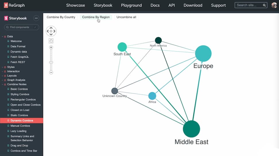
This webinar, led by Corey Lanum, author of Visualizing Graph Data by Manning Publications, covers everything you need to start a successful graph data visualization project.
Who needs graph visualization?
Graph visualization plays a mission-critical role in all kinds of use cases and many different industries.
Initially adopted by early pioneers in sectors like banking and law enforcement, graph visualization has since become indispensable in many other fields. Over the past decade, its popularity has surged, driven by the need to understand increasingly complex datasets.
Financial crime
Visualize unusual activities and connections to identify, investigate and predict any type of financial crime – from identity theft to money laundering.
Cyber security
Understand cyber threats, reveal network vulnerabilities, detect malware and discover trends using visualization techniques.
Law enforcement
Use data visualization to uncover threats and critical intelligence to help make the world safer.
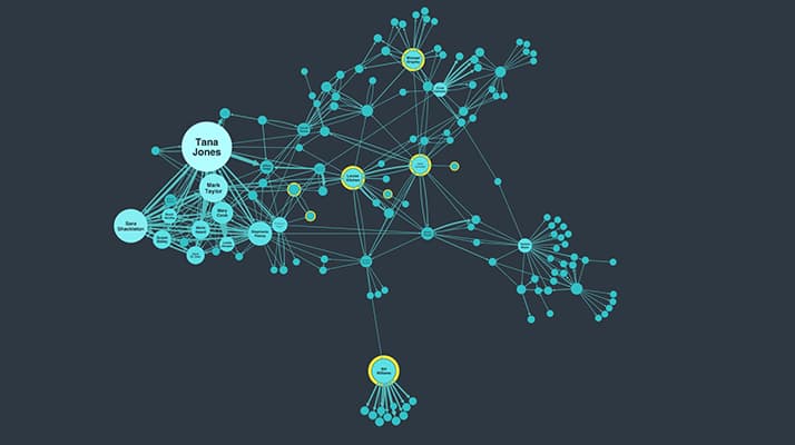
Explore our top Graph visualization use cases
JavaScript tools and tutorials
When it comes to building your own graph visualizer, you have options.
There are standalone commercial tools, available off-the-shelf. Or community-built open source code libraries. Or you can create something in-house from scratch. Or, if you want the best of all worlds, you can choose a commercial SDK.
Our commercial SDKs are market leaders. They deliver the customizability and flexibility of in-house components, with the reliability, robustness, performance and advanced functionality of a technology backed by a dedicated team of experts.
KeyLines
The graph visualization SDK for JavaScript developers
KeyLines is your fast-track to graph visualization success on any tech stack. Rapidly create robust, beautiful and engaging visual tools that match the scale of your users’ data challenges.
ReGraph
Hassle-free graph visualization for React developers
Designed specifically for the React framework, the ReGraph SDK makes building state-based graph visualizations a breeze. You’ll have powerful, interactive and stand-out visual tools ready in no time.
Using a different tech stack?
We’ve designed our data visualization SDKs to work seamlessly with any tech stack or data source. Here’s a selection of our most popular integration tutorials.
Graph visualization best practices
Beyond selecting your tools and tech stack, there are tips and tricks that’ll help make your project a success.
We’ve shared this best practice advice with hundreds of successful product teams over the past decade.
User experience
How to avoid wrecking your graph app
The best data in the world is useless if your users can’t access it. A carefully designed, intuitive user experience (UX) makes all the difference.
4 easy styling options
Our SDKs let you create your own user experience. Here are 4 smart and simple styling options that take full advantage of that flexibility.
Building accessible applications
Nearly 15% of people have a disability that could impact their ability to use software. Accessibility is essential.
Choosing the right colors
The brain instinctively accumulates and interprets certain cues from color. Use it to make visualizations that feel instantly familiar.
The data and visual model
Graph data modeling 101
How do you transform flat, tabular data into an intuitive graph model that works for all your users? What becomes a node, a link, or an attribute?
Big graph data visualization
Five steps to tackle big graph data visualization
How do you turn millions (or billions) of nodes into something your users will understand? The data visualization funnel holds the answers.
Graph visualization at scale
The reality of visualizing huge volumes of graph data is messy, noisy, laggy charts. This post outlines two potential strategies.
Common challenges
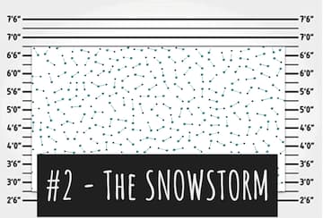
Hairballs, snowstorms and starbursts can be a problem for many projects, obscuring data and preventing users from finding the insight they need. But we have solutions – click the images below to learn more.
