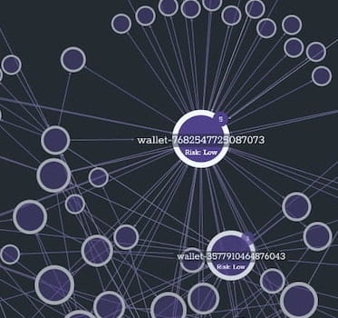
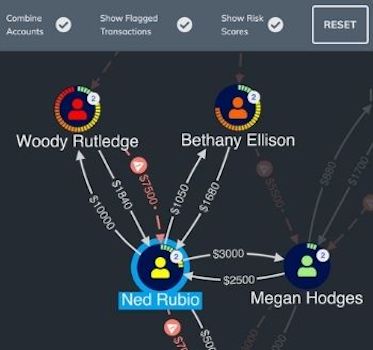
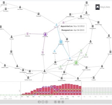
9 techniques for your blockchain analysis tool
Andrew Disney Marketing Director
7th March, 2022 | 8 min read
Follow these techniques to build a blockchain analysis tool and make sense of vast & complex blockchain data...
Andrew Disney Marketing Director
7th March, 2022 | 8 min read
Follow these techniques to build a blockchain analysis tool and make sense of vast & complex blockchain data...
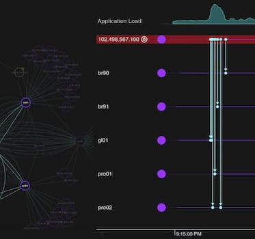
Matt Latham Product Manager
4th March, 2022 | 2 min read
We’ve recently released new feature-rich versions of KronoGraph, our timeline visualization toolkit. Our...
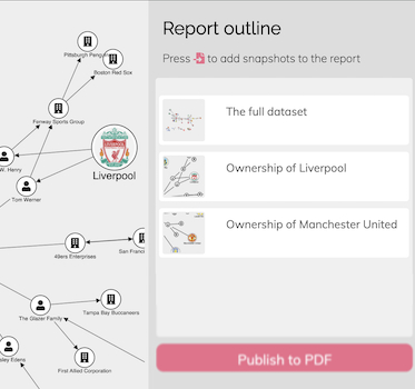
Dan Williams Chief Product Officer
1st March, 2022 | 9 min read
We use our graph visualization toolkits to publish a PDF report based on multiple snapshots of interactive graph...
Christian Lentfort Developer
15th February, 2022 | 5 min read
In this technical tutorial for developers, we’ll show you how to get ReGraph running smoothly in Remix, a...
Thomas Chan Software Developer
11th February, 2022 | 5 min read
Find out how quick and easy it is to integrate Angular with KeyLines, our graph visualization toolkit for...
Phil Rodgers Principal Team Lead
8th February, 2022 | 3 min read
We’ve used KeyLines, our graph visualization toolkit, to reveal the word that gives you the best tactical...
Christian Miles VP of Sales
7th February, 2022 | 10 min read
Want to integrate KeyLines or ReGraph with Microsoft Azure Cosmos DB? This developer tutorial gives you full...
Rosy Hunt Content Marketing Specialist
1st February, 2022 | 6 min read
Unstruk Data’s unstructured data platform uses ReGraph to help people transform big, complex data into...
Thomas Chan Software Developer
25th January, 2022 | 12 min read
Our updated guide to building a custom root cause analysis timeline and graph visualization app in React, with...
Registered in England and Wales with Company Number 07625370 | VAT Number 113 1740 61
6-8 Hills Road, Cambridge, CB2 1JP. All material © Cambridge Intelligence .
Privacy Policy | Security Framework
