
How link analysis for AML powers successful compliance
Catherine Kearns Content Strategist & Team Lead
9th January, 2024 | 8 min read
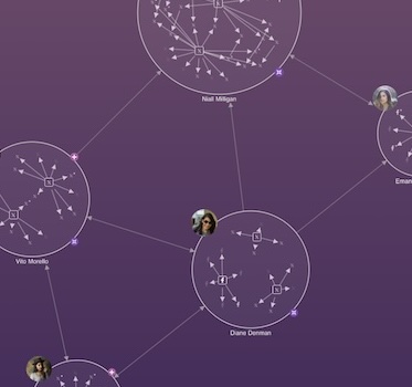
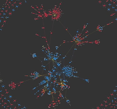
When it comes to combating money laundering, link analysis and AML go hand in hand. In this blog post, we’ll see...
Catherine Kearns Content Strategist & Team Lead
9th January, 2024 | 8 min read
When it comes to combating money laundering, link analysis and AML go hand in hand. In this blog post, we’ll see...

Rosie Griffin HR Advisor
3rd January, 2024 | 4 min read
We always welcome discussions around flexible working, to help everyone build a successful career alongside a...
Kevin Naughten Senior Product Manager
19th December, 2023 | 7 min read
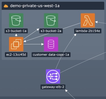
Data overload is a real problem for busy analysts. How do they spot the red flags in a cyber security network? Or...
Bonney O'Hanlon Product Manager
19th December, 2023 | 2 min read
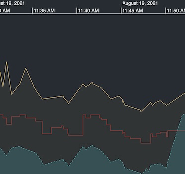
The latest version of KronoGraph, our timeline analysis SDK, sees time series charts move out of beta development...
Kevin Naughten Senior Product Manager
12th December, 2023 | 3 min read
With every version of our KeyLines and ReGraph graph visualization toolkits, we aim to share new features that...

Corey Lanum Chief Product Evangelist
14th November, 2023 | 15 min read
In this tutorial, you’ll find out how to use Neo4j and KronoGraph to create an interactive timeline...

Andrew Disney Marketing Director
13th November, 2023 | 2 min read
Together with our partners at Sistemi & Automazione, we’ve secured a tender to provide Italy’s central...
Khadeja Sajjad Software Developer
9th November, 2023 | 9 min read
Analysts rely on our data visualization toolkits to spot hidden patterns in their visualized data. They...
Corey Lanum Chief Product Evangelist
31st October, 2023 | 6 min read
I use graph visualization to reveal insights in US election campaign data: which orgs donate to both Republican...
Registered in England and Wales with Company Number 07625370 | VAT Number 113 1740 61
6-8 Hills Road, Cambridge, CB2 1JP. All material © Cambridge Intelligence .
Privacy Policy | Security Framework
