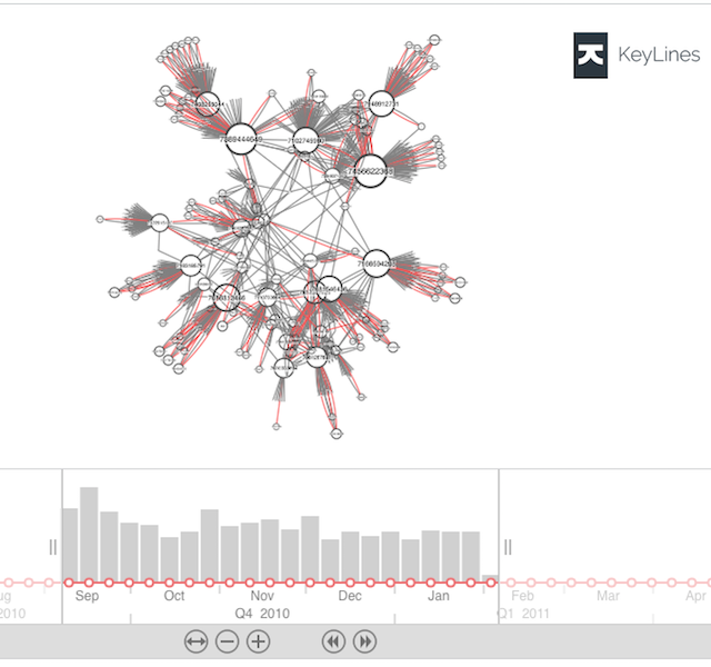
Bring time-series data to life with visualization
Catherine Kearns Content Strategist & Team Lead
3rd December, 2018 | 8 min read
We integrate KeyLines with InfluxDB – a time series database (TSDB) – to see how it can help us...
Catherine Kearns Content Strategist & Team Lead
3rd December, 2018 | 8 min read
We integrate KeyLines with InfluxDB – a time series database (TSDB) – to see how it can help us...
Dan Williams Chief Product Officer
20th November, 2018 | 2 min read
We’re excited to announce the release of KeyLines 5.0: the next generation in visualizing connections in...
Andrew Disney Marketing Director
13th November, 2018 | 6 min read
We use the advanced features of our graph visualization technology to test the friendship paradox. We’ll show...
Dan Williams Chief Product Officer
17th October, 2018 | 7 min read
With KeyLines and Neo4j graph database integrations, exploiting geospatial data has never been easier. Discover...

Dan Williams Chief Product Officer
18th July, 2018 | 5 min read
We take a closer look at how we used graph theory to predict France as the 2018 FIFA World Cup winners....
Christian Miles VP of Sales
18th June, 2018 | 5 min read
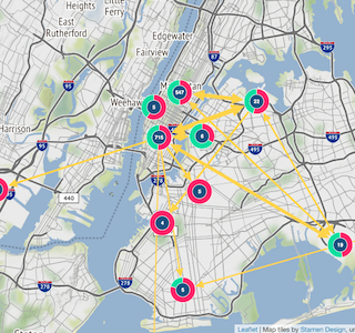
In this blog, we use a New York taxi cab database to show how graph visualization can be useful when working with...
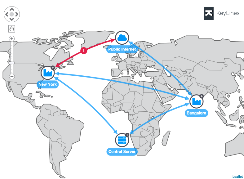
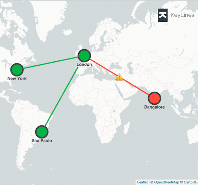
Dan Williams Chief Product Officer
12th March, 2018 | 5 min read
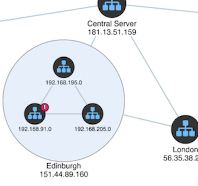
In this blog post, we’ll show you how network visualization can make alert detection and investigation more...

Christian Miles VP of Sales
29th August, 2017 | 6 min read
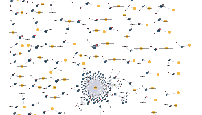
Using data from online adverts, we explore a graph visualization-led approach to understanding human trafficking...
Dan Williams Chief Product Officer
13th June, 2017 | 6 min read
Using connected data visualization techniques to manage supply chain risk, ensure restricted substance compliance...
Registered in England and Wales with Company Number 07625370 | VAT Number 113 1740 61
6-8 Hills Road, Cambridge, CB2 1JP. All material © Cambridge Intelligence .
Privacy Policy | Security Framework
