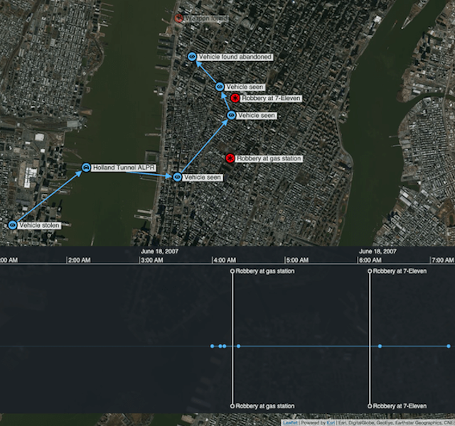
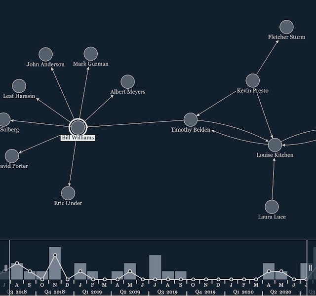
Interactive timeline tools for joined-up investigations
Andrew Disney Marketing Director
23rd February, 2021 | 4 min read
To build a criminal case, investigators collate information from all sources, revealing an accurate and compelling...
Andrew Disney Marketing Director
23rd February, 2021 | 4 min read
To build a criminal case, investigators collate information from all sources, revealing an accurate and compelling...
Andrew Disney Marketing Director
26th January, 2021 | 6 min read
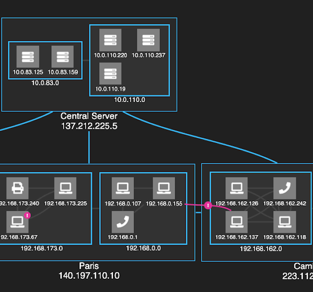
Watch any good (trashy) police drama and you’ll quickly spot a few cliches. The maverick cop (tough, but with a...
Thomas Chan Software Developer
12th January, 2021 | 6 min read
Follow this React Material UI tutorial to get Material Design icons working with ReGraph and build stylish graph...
Andrew Disney Marketing Director
5th January, 2021 | 7 min read
See how Traversals combine search, data fusion, translation, and NLP to produce custom knowledge graphs on any...
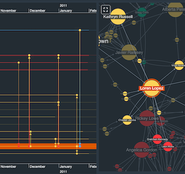
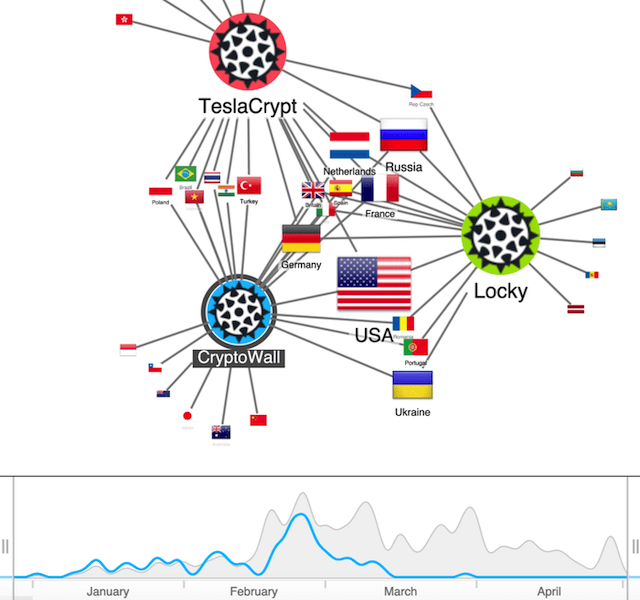
Andrew Disney Marketing Director
24th December, 2020 | 6 min read
Let’s look at the time bar and how it makes visualizing time-based graph data a breeze. We’ll also...
Catherine Kearns Content Strategist & Team Lead
15th December, 2020 | 5 min read
Our ReGraph and KeyLines graph visualization toolkits support new rectangular combos: a fresh approach to grouping...
Dan Williams Chief Product Officer
8th December, 2020 | 4 min read
Our latest toolkit updates include rectangular combos, a revised KeyLines Neo4j tutorial, and ReGraph support for...
Andrew Disney Marketing Director
24th November, 2020 | 10 min read
We explore basic color theory, and how carefully-chosen colors can help make your visualizations look good, and...
Andrew Disney Marketing Director
18th November, 2020 | 8 min read
In this updated post, we explore popular dynamic network visualization methods, and look at how our data...
Registered in England and Wales with Company Number 07625370 | VAT Number 113 1740 61
6-8 Hills Road, Cambridge, CB2 1JP. All material © Cambridge Intelligence .
Privacy Policy | Security Framework
