Introducing MapWeave: geospatial visualization that reveals every connection
Bonney O'Hanlon Product Manager
12th March, 2025 | 5 min read
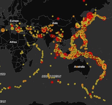
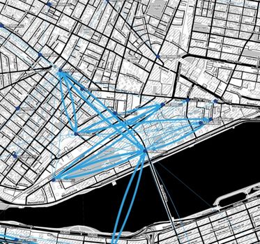
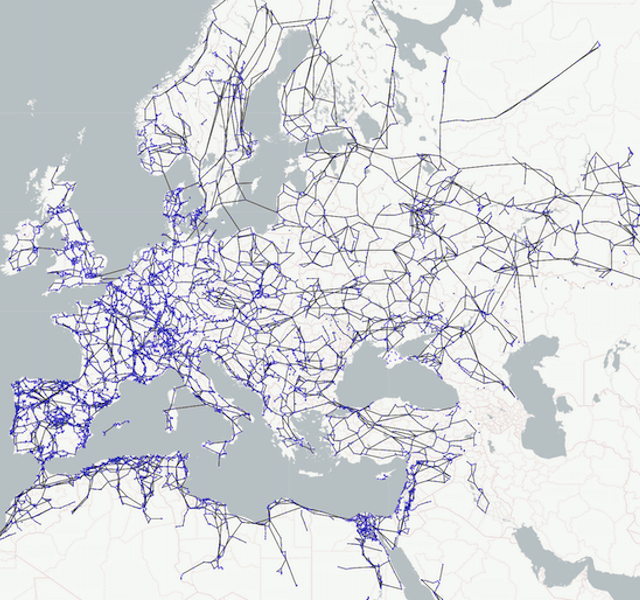
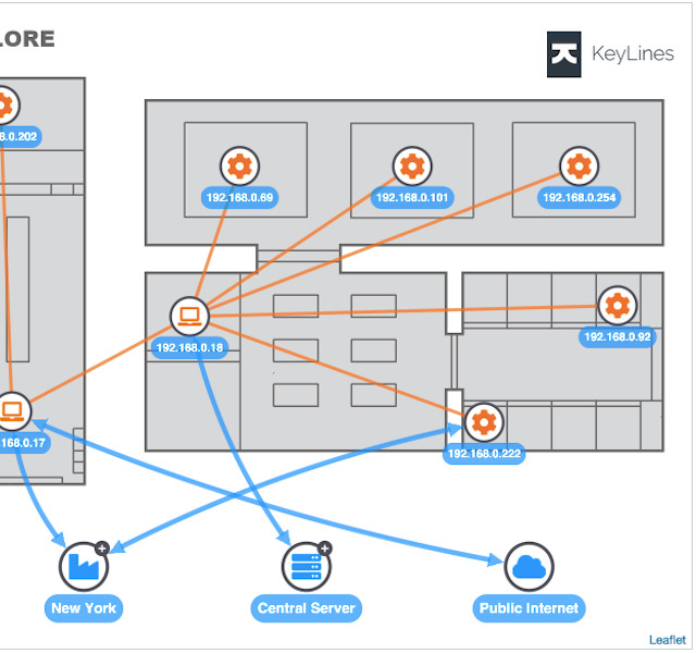
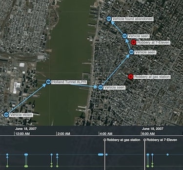
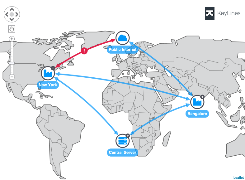
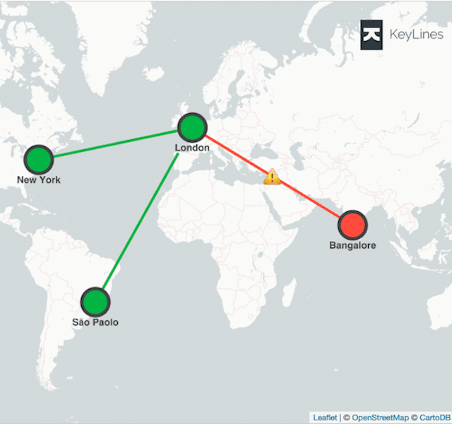
Say goodbye to cluttered maps, disjointed geospatial visualization and analysis that only tells you half the...