Graph visualization helps analysts and investigators explore complex connections, detect fraud, and analyze networks in fields like cybersecurity and intelligence. This guide covers how it works, why it matters, and the best tools to get started with links to expert articles for deeper insights.
What is graph visualization?
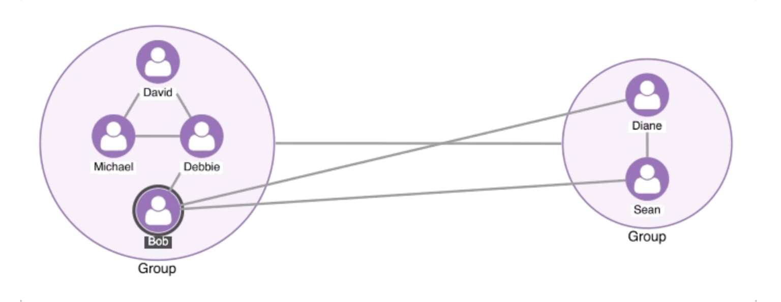
Graph visualization, also called network visualization or link analysis, is the process of visually representing relationships between data points. Instead of viewing data as tables or lists, graph visualization maps connections as nodes (entities) and links (relationships), making it easier to explore complex structures.Key features of graph visualization
Nodes & Links: Nodes represent entities such as individuals, devices, or accounts, while links show the relationships between them, like transactions, interactions, or communications.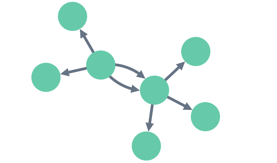 Interactivity: Users can interact with functions like zooming, panning, and
dragging, which help them investigate specific nodes and regions.
Layouts & Algorithms: Help uncover patterns like clusters, anomalies, and shortest
paths.
Interactivity: Users can interact with functions like zooming, panning, and
dragging, which help them investigate specific nodes and regions.
Layouts & Algorithms: Help uncover patterns like clusters, anomalies, and shortest
paths.
Why is graph visualization important?
Graph visualization makes it easy to see, explore and understand complex relationships in data where traditional data analysis methods struggle. Graph visualization helps by: Revealing hidden patterns- Detects anomalies: Quickly spot fraud, security threats, and unusual activity.
- Identifies key influencers: Find the most connected and influential nodes in a network.
- Uncovers communities & clusters: Group similar entities together to detect trends.
- Faster insights: Spot patterns visually, without needing deep technical skills.
- Real-time analysis: Interactive tools update as data changes, enabling dynamic decision-making.
- Holistic view: See beyond individual data points, revealing the wider context, structure and relationships within data.
Common use cases for graph visualization?
Graph visualization plays a mission-critical role in areas like cybersecurity, fraud detection, and intelligence, where understanding complex relationships and spotting hidden patterns is crucial. It helps organizations quickly identify threats, uncover fraudulent activity, and analyze complex data connections for better decision-making.- Cybersecurity: Track suspicious network activity and attack patterns.
- Fraud Detection: Identify abnormal transactions and money laundering networks.
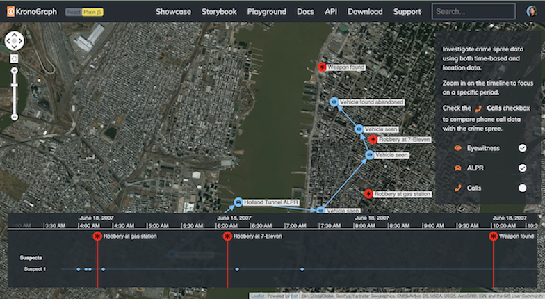
- Intelligence & Law enforcement: Map criminal networks, telecom metadata, and OSINT data.
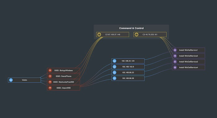
Graph visualization for cybersecurity
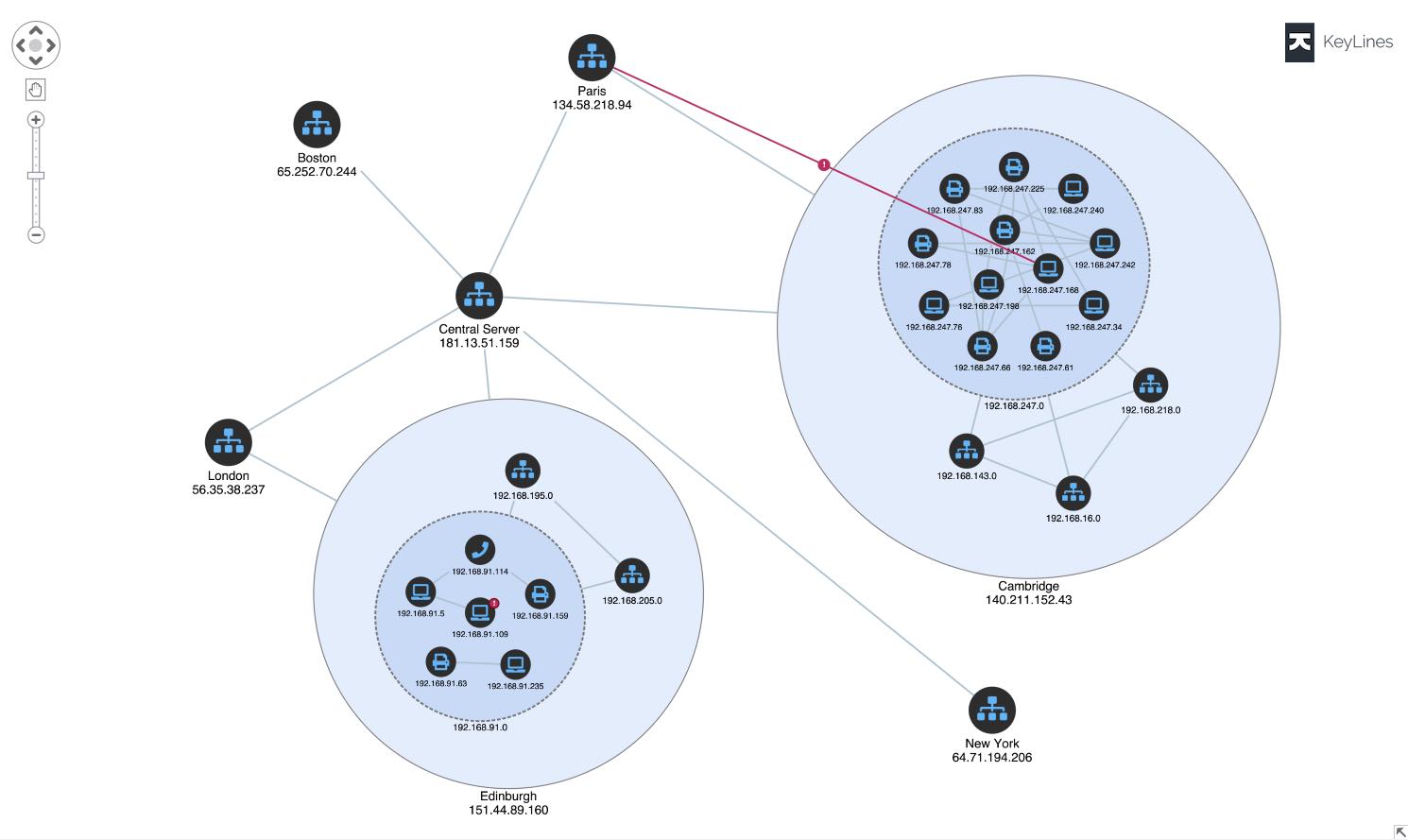 Cyber security is about understanding network
vulnerabilities and protecting them from malicious attacks. Data is measured in terabytes, and
it’s not unusual for enterprises to handle billions of alerts each day.
Analysts require visualization tools to better understand the big picture and perform effective triages. Without it, alerts could be missed, vulnerabilities exploited and post-attack forensics inefficiently managed.
Cyber security is about understanding network
vulnerabilities and protecting them from malicious attacks. Data is measured in terabytes, and
it’s not unusual for enterprises to handle billions of alerts each day.
Analysts require visualization tools to better understand the big picture and perform effective triages. Without it, alerts could be missed, vulnerabilities exploited and post-attack forensics inefficiently managed.
Graph visualization for fraud detection
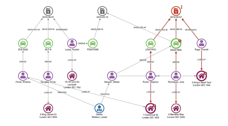 The financial services industry was another early adopter of graph visualization techniques.
Fraud detection is about finding unusual connections between things like accounts, transactions,
insurance policies, and devices. There’s great value in visualizing that data as a graph.
Graph analysis techniques are widely used in the banking and insurance industries. And over time,
we’ve seen them used to tackle other kinds of fraud, including healthcare fraud, gambling fraud, review fraud and even fake news.
Take blockchain transactions, for example. This graph visualization tracks six minutes of
fast-paced, complicated Bitcoin transactions in an intuitive, explorable way:
The financial services industry was another early adopter of graph visualization techniques.
Fraud detection is about finding unusual connections between things like accounts, transactions,
insurance policies, and devices. There’s great value in visualizing that data as a graph.
Graph analysis techniques are widely used in the banking and insurance industries. And over time,
we’ve seen them used to tackle other kinds of fraud, including healthcare fraud, gambling fraud, review fraud and even fake news.
Take blockchain transactions, for example. This graph visualization tracks six minutes of
fast-paced, complicated Bitcoin transactions in an intuitive, explorable way:
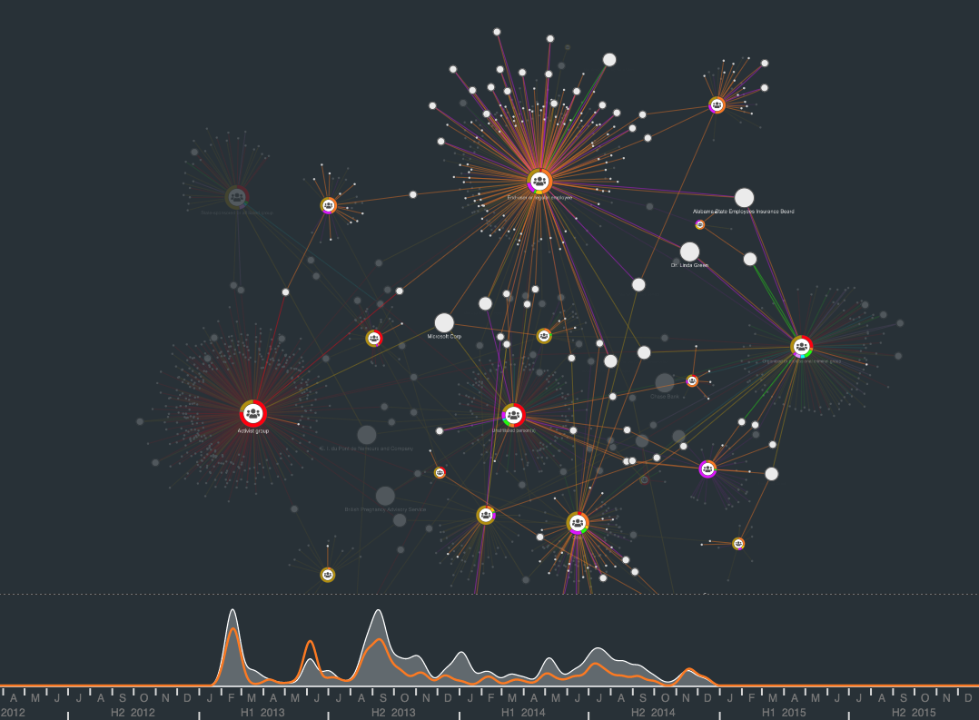
Graph visualization for law enforcement & intelligence
 Criminal investigators have used graph visualization for decades. What has changed in forensic
data visualization use cases over time is the technology used to make the process more automated
and scalable.
Following the terror attacks in early 2000s, the intelligence services reflected on their failure to analyze the bigger, joined-up picture. They quickly developed an interest in link analysis software for law enforcement and security agencies. This led to designing new approaches and technologies for large-scale data analysis of communications records, open-source intelligence (OSINT), and police databases.
Lawful interception, also known as the legally mandated interception of personal communications
data, provides
huge volumes of data on criminal and terrorist activity. Non-specialist staff were able to pair
social network analysis with graph visualization
techniques to explore the data and uncover important insight. They use these techniques on
everything from visualizing OSINT data to support due
diligence investigations to uncovering human
trafficking activity.
Because this kind of analysis is so complex and specialized, many law enforcement agencies use
our toolkits to build their own visualization solutions, instead of relying on off-the-shelf
products. The scale of the data they work with has also transformed the nature of the
visualization: it’s now essential to have effective layouts, filtering and grouping, as well as powerful
graphics rendering.
If you want more examples, this webinar
with Neo4j shows how visualizing data from crime records helps users to understand
patterns and allocate resources wisely. And Big data & law enforcement
visualizations explains two possible uses for visualization in an event and
investigation-led approach.
Criminal investigators have used graph visualization for decades. What has changed in forensic
data visualization use cases over time is the technology used to make the process more automated
and scalable.
Following the terror attacks in early 2000s, the intelligence services reflected on their failure to analyze the bigger, joined-up picture. They quickly developed an interest in link analysis software for law enforcement and security agencies. This led to designing new approaches and technologies for large-scale data analysis of communications records, open-source intelligence (OSINT), and police databases.
Lawful interception, also known as the legally mandated interception of personal communications
data, provides
huge volumes of data on criminal and terrorist activity. Non-specialist staff were able to pair
social network analysis with graph visualization
techniques to explore the data and uncover important insight. They use these techniques on
everything from visualizing OSINT data to support due
diligence investigations to uncovering human
trafficking activity.
Because this kind of analysis is so complex and specialized, many law enforcement agencies use
our toolkits to build their own visualization solutions, instead of relying on off-the-shelf
products. The scale of the data they work with has also transformed the nature of the
visualization: it’s now essential to have effective layouts, filtering and grouping, as well as powerful
graphics rendering.
If you want more examples, this webinar
with Neo4j shows how visualizing data from crime records helps users to understand
patterns and allocate resources wisely. And Big data & law enforcement
visualizations explains two possible uses for visualization in an event and
investigation-led approach.
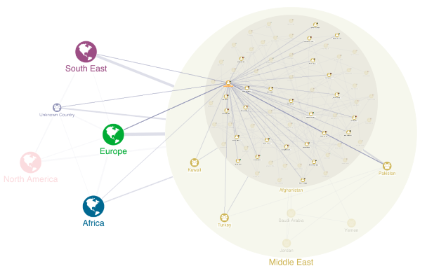
Other use cases
Graph visualization doesn’t work only for our 3 main use cases which we discussed in earlier sections of this guide, below we present more industries and use cases where graph visualization can help connect the dots and improve understanding of data on wider scale.Regulatory compliance
Organizations need to manage and prove compliance with relevant laws, regulations and standards. This often involves grappling with complex scenarios and data to understand non-compliance risk. Graph visualization is the perfect tool for the process.AML and KYC
In financial services, due diligence processes like Know Your Customer (KYC) and Anti-Money Laundering (AML) are especially cumbersome. An understanding of customer history and behaviors depends on a strong data analysis process and an interactive graph visualization tool. Banking organizations use our graph and timeline visualization SDKs to uncover risks like:-
-
- Politically Exposed Persons (PEPs) – high-profile individuals who need enhanced due diligence
- Beneficial owners – exploring networks of entities to understand a customer’s control and ownership structure
- Correspondent banking relationships – preventing the misuse of international banking relationships
-
Data protection and GDPR
Data protection regulations are ideal candidates for a graph-led approach. In this webinar with graph and GDPR experts trust-hub, we demonstrate the role of visualization in data privacy lifecycle management:Logistics and operations
Graph visualization is the ideal tool to understand flow. Organizations need efficient, traceable supply chains that can adapt to change and avoid bottlenecks. IoT, telecoms, oil and gas – these industries rely on physical networks of infrastructure to function. A relatively minor failure in those networks can cause critical problems costing millions of dollars.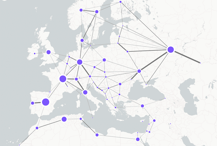
Knowledge graphs & management
The final use case we’re going to cover is perhaps the broadest: knowledge graphs. Take Google, for example. While their early competitors tried to flatten the internet’s densely connected network of information into a huge library catalogue, Google understood the power of the graph and embraced the connected nature of data. They explore the connections between sites, promote those with more authority and generate a more helpful view of the internet. Now, with the democratization of graph technologies, individual firms can follow suit. Enterprises worldwide are investing in silo-breaking projects to centralize and connect their organization knowledge. Also think about the vastly complex neural networks that rely on natural language processing (NLP) to interpret queries and communicate results to users. AI models like ChatGPT and Bard are essentially huge knowledge graphs created in real time. The best business strategies depend on a deep understanding of complex information. Graph visualization helps successful businesses cut through noise, uncover connections and extract actionable insights with minimal effort. Traversals: powering the intelligence cycle for business shows how a SaaS intelligence platform uses our graph technology to drive business-critical decisions. Another customer developed a graph-powered insights engine that uses natural language processing to help users uncover insight in their connected data. The insights engine generates knowledge graphs that are visualized using KeyLines, our graph visualization toolkit for JavaScript developers.What are the best graph visualization tools?
There are several powerful graph visualization tools available to help organizations unlock the full potential of their data. The right software depends on your specific needs, such as scalability, ease of use, and customization options. Here are some of the leading solutions:- KeyLines & ReGraph by Cambridge
Intelligence: Flexible and powerful graph visualization libraries designed
for
building custom applications with complex networks.
- Designed for enterprise-level graph visualization and analysis.
- Powerful for cybersecurity, intelligence, and fraud detection.
- Offers advanced layouts, styling, and interactivity.
- Neo4j Bloom: Works with Neo4j graph databases. Ideal for data scientists exploring connected data.
- Gephi: An open source graph visualization and analysis software ideal for large networks and data exploration. Best for static network analysis and social network graphs.
- Cytoscape: An open source software platform for complex network analysis and visualization, often used in bioinformatics but could be adaptable for other industries.
Getting started with graph visualization
Graph visualization simplifies complex data, helping users quickly identify patterns and insights. To create effective visualizations, it’s important to understand core principles such as user experience (UX) design, graph data modeling, accessibility, and color theory. These practices ensure that your applications are intuitive, accessible, and impactful. In addition to foundational principles, key techniques make graph data more interpretable. These include graph layouts that organize nodes and edges for clarity, centrality measures identifying important nodes based on their connections, graph analytics using algorithms to uncover deeper insights, and time-based graphs visualizing network evolution over time for added context.
FREE: Start your trial today
Visualize your data! Request full access to our SDKs, demos and live-coding playgrounds.
Frequently asked questions about graph data visualization
What is a graph visualization SDK?
A graph visualization SDK is a developer toolkit for building interactive, high-performance visualizations of connected data. It offers flexibility and scalability, helping developers create custom applications for exploring complex data. If you need a graph data visualization solution, you have a few options:
-
- Off-the-shelf applications come with a pre-built interface and features. They offer a simple, one-size-fits-all approach, ideal for basic analysis tasks.
-
- Graph visualization SDKs let you design and build custom applications tailored to your users’ needs. This makes them easier to use and more effective for in-depth analysis.
- Open source libraries provide a starting point for visualization but often require significant customization and engineering effort to match the performance, scalability, and ease of use of dedicated solutions.
What are alternatives to node-link graph visualization?
Node-link graph visualization is often the best choice for exploring connected data, but in some cases, alternative data visualization approaches can complement or even better suit your data. Here are a few we come across often: Geospatial visualization: Map views can be an alternative to graph-based visualizations when you need to display connected data in its spatial context. These can range from simple connected location markers on a map, to more sophisticated geospatial graph visualization tools with a rich interactive user experience. Read more about geospatial visualization. Timeline visualization: Timeline visualization is a powerful tool for representing data or events in a sequential order over time. It is particularly effective for displaying connections between events and entities over time, to see how events unfolded and uncover key moments. Read more about timeline visualization. Heatmaps: Heatmaps use color gradients to represent values, making them useful for understanding density or intensity across a large dataset. They’re especially useful in situations where you want to highlight variations in data – for example, time periods of intense activity. Read more about heatmapping. Chord diagrams: A chord diagram is a circular visualization that shows relationships between data categories using arcs and curved links. It’s useful for showing connections between a relatively small number of entities – such as trade flows or simple network structures. Read more about chord diagrams.What are common challenges in graph visualization?
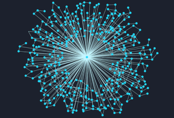
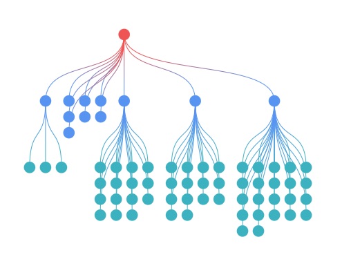
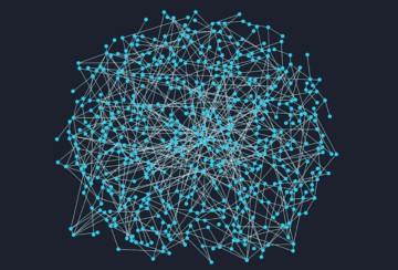
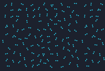
The connected nature of graph data can pose some tricky visualization challenges. Datasets with too many connections become ‘hairballs’. Too few connections leads to ‘snowstorms’. Networks with a single super-connected nodes create ‘starbursts’. Happily, powerful graph visualization techniques and tools can help users solve them all. Click the images below to learn more:Hairballs
Snowstorms
Starbursts